Project Tulong
Logo Design & Branding
Adobe Illustrator
THE CLIENT
Project Tulong – Orlando, Florida
PROJECT DATE
March 2023
ROLE
UX/UI and Graphic Designer
My task is to design the logo and the UX and UI of their official website.
OVERVIEW
Project Tulong is a non-profit organization established in 2022 in Orlando, Florida. The word ‘Tulong’ means help in Tagalog, the native language in the Philippines – their goal is to help the people from the less fortunate cities in the Philippines.
In December 2022, the founders, a married couple, Kristine and Winston, visited the Philippines and had the opportunity to share their blessings. They were able to donate 185 food bags and 325 school supplies to the children of a local community including an orphanage located in Kristine’s hometown. It was a very meaningful experience for them and they wanted to continue this every year as a tradition, so they decided to turn this into a non-profit organization and called it Project Tulong.
THE DESIGN
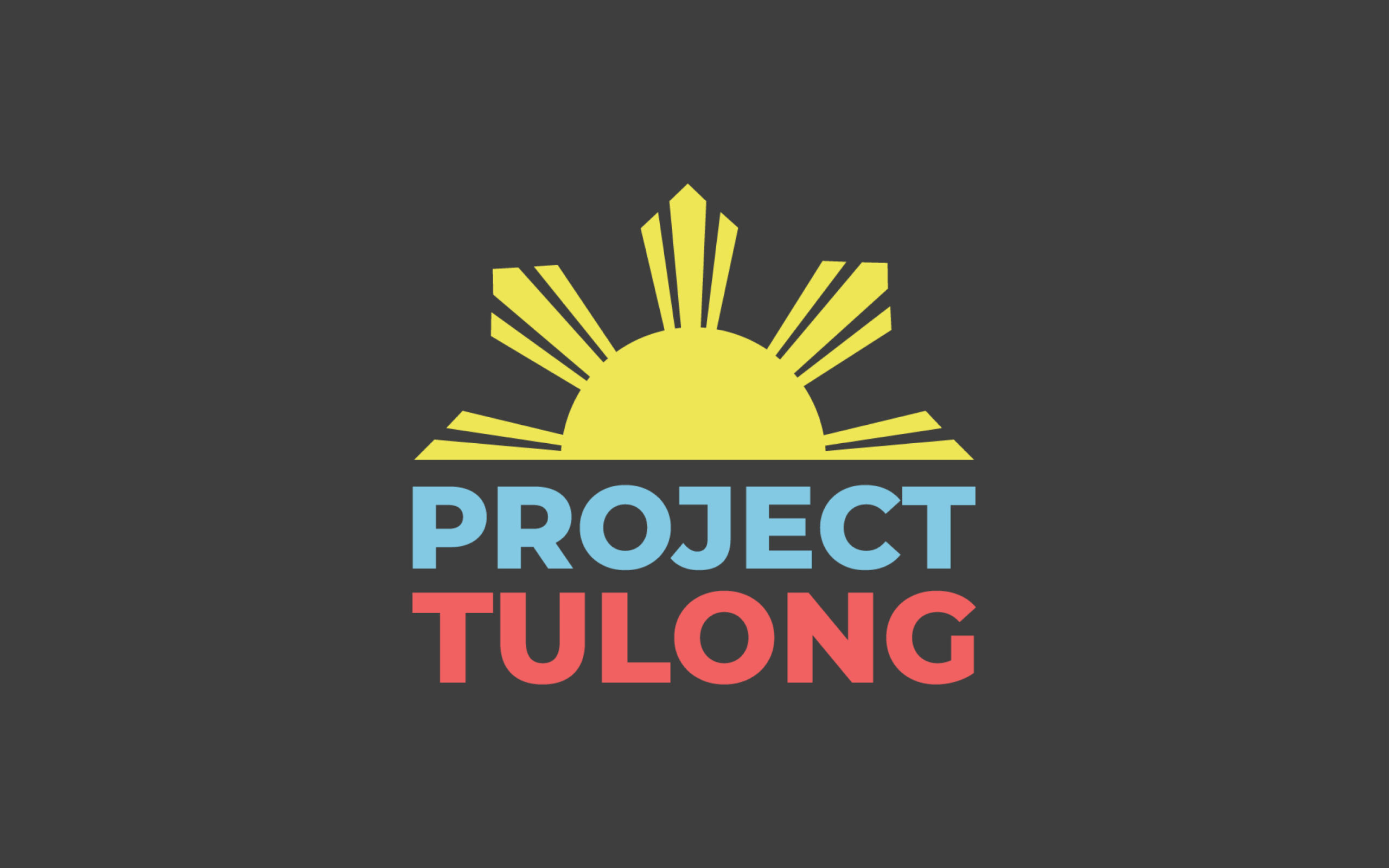
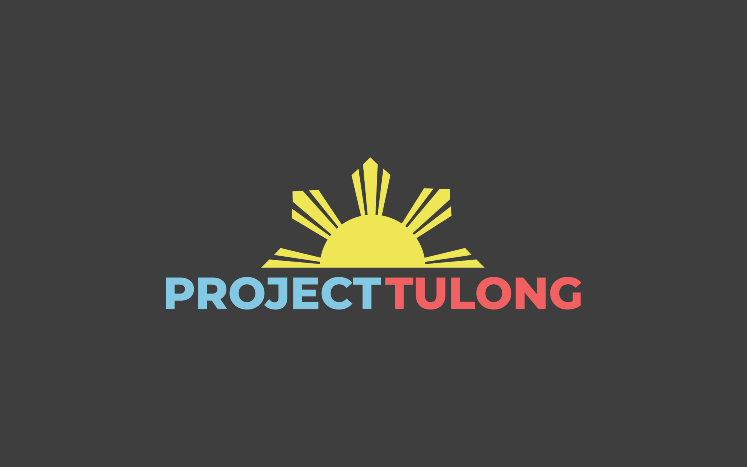
For this project, I was given the full creative freedom to design the logo. The client only asked if we can incorporate the sun from the Philippine flag. I had the idea of putting the sun on the ‘Os’ of the words ‘Project’ and ‘Tulong’, but it was not successful – so I thought of just using half of the sun, so it can go on top of the words and I can align it perfectly to the text. By putting the sun on top of the text, it can be larger compared to if I had put it inside the text, its size will be limited.
I used a sans serif font in bold for a cleaner look and I also thought that the straight lines and sharp corners of the letters would match the rays of the sun. I aligned the two words vertically and since the word ‘Tulong’ is one letter shorter than the word ‘Project’, I was able to enlarge it and give more emphasis to it.
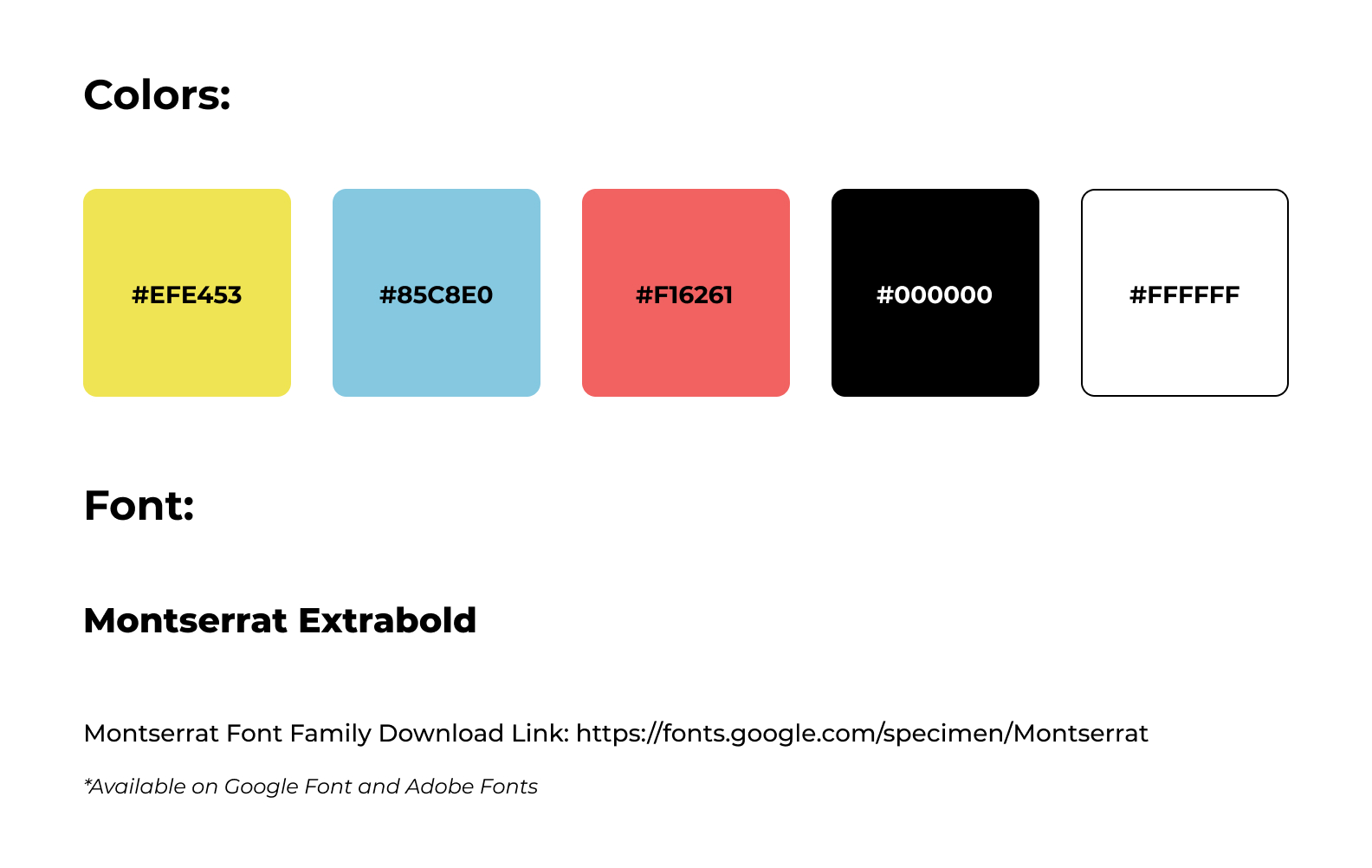
Since the inspiration is the Philippines and the Philippine flag, I thought of using the nation’s colors: blue, red, and yellow – but I muted them, so it will be easier for the eyes of the viewers. The sun, of course, takes the yellow, the word ‘Project’ takes the blue, and the word ‘Tulong’ takes the red – I put the blue above the red because that is how it is on the nation’s flag – it means peace before valor. This logo also works in solid black and white.
Lastly, I made a horizontal version of this logo for flexibility. See the designs below.
Style Guide:
The Logo
Horizontal Version
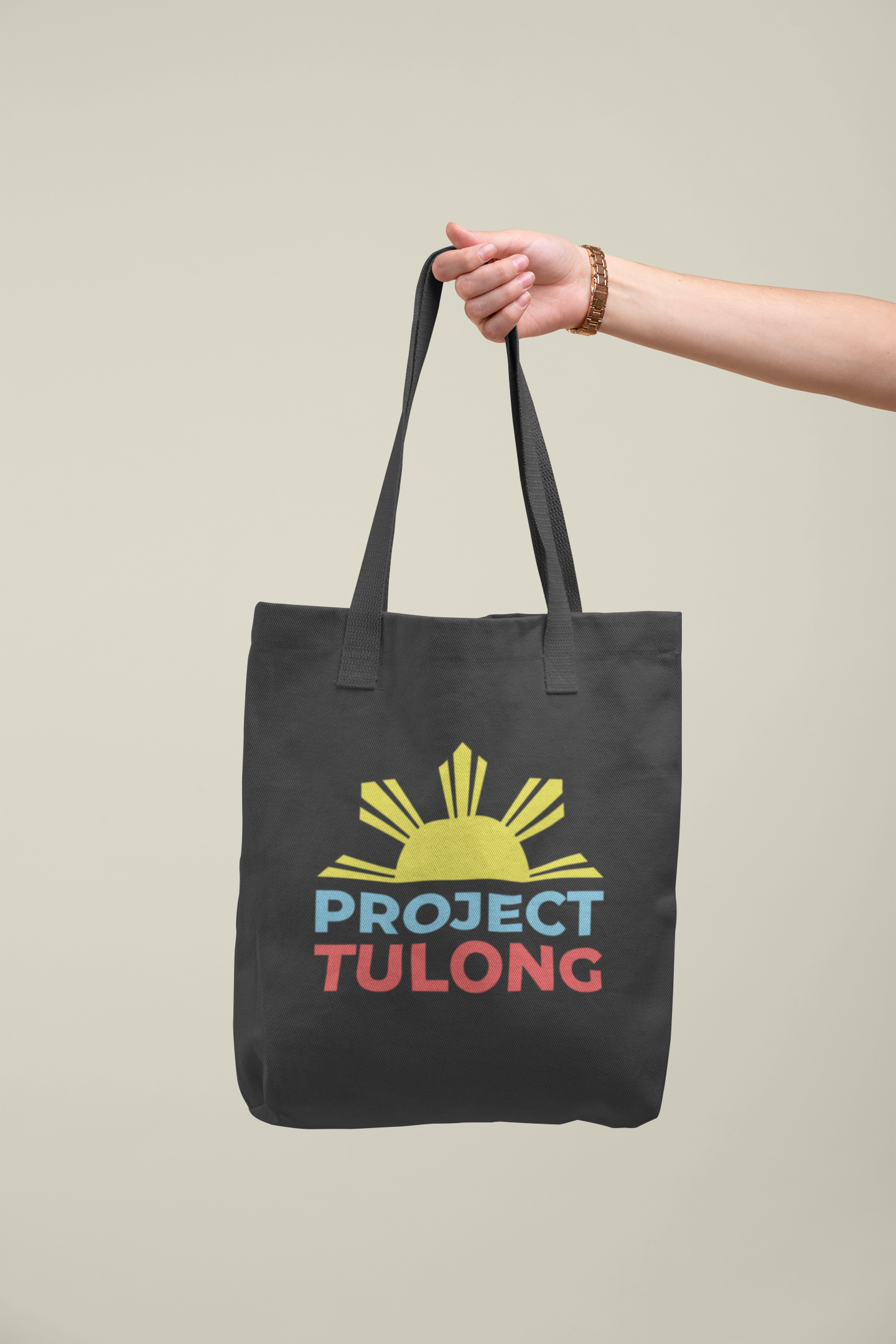
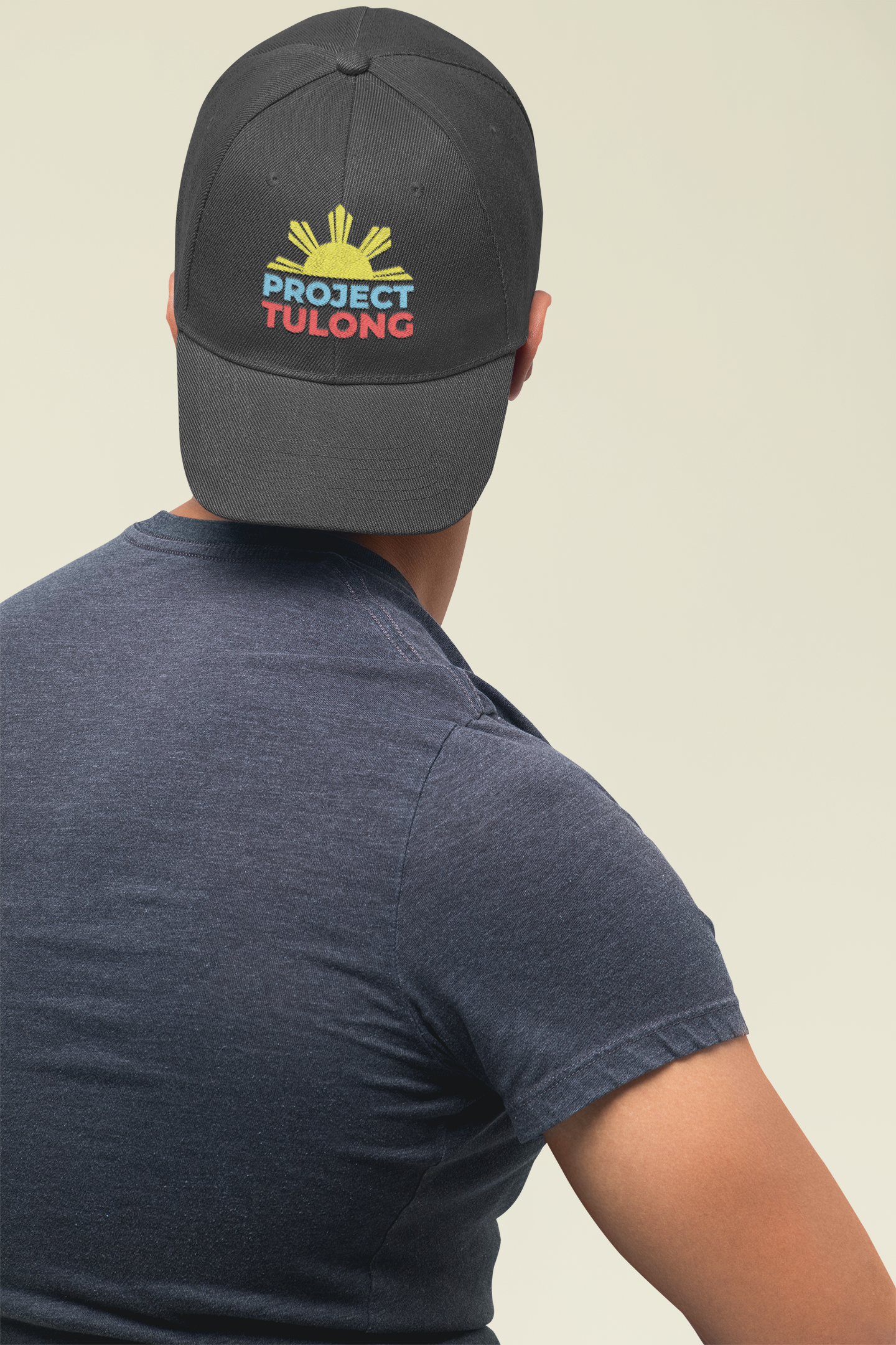
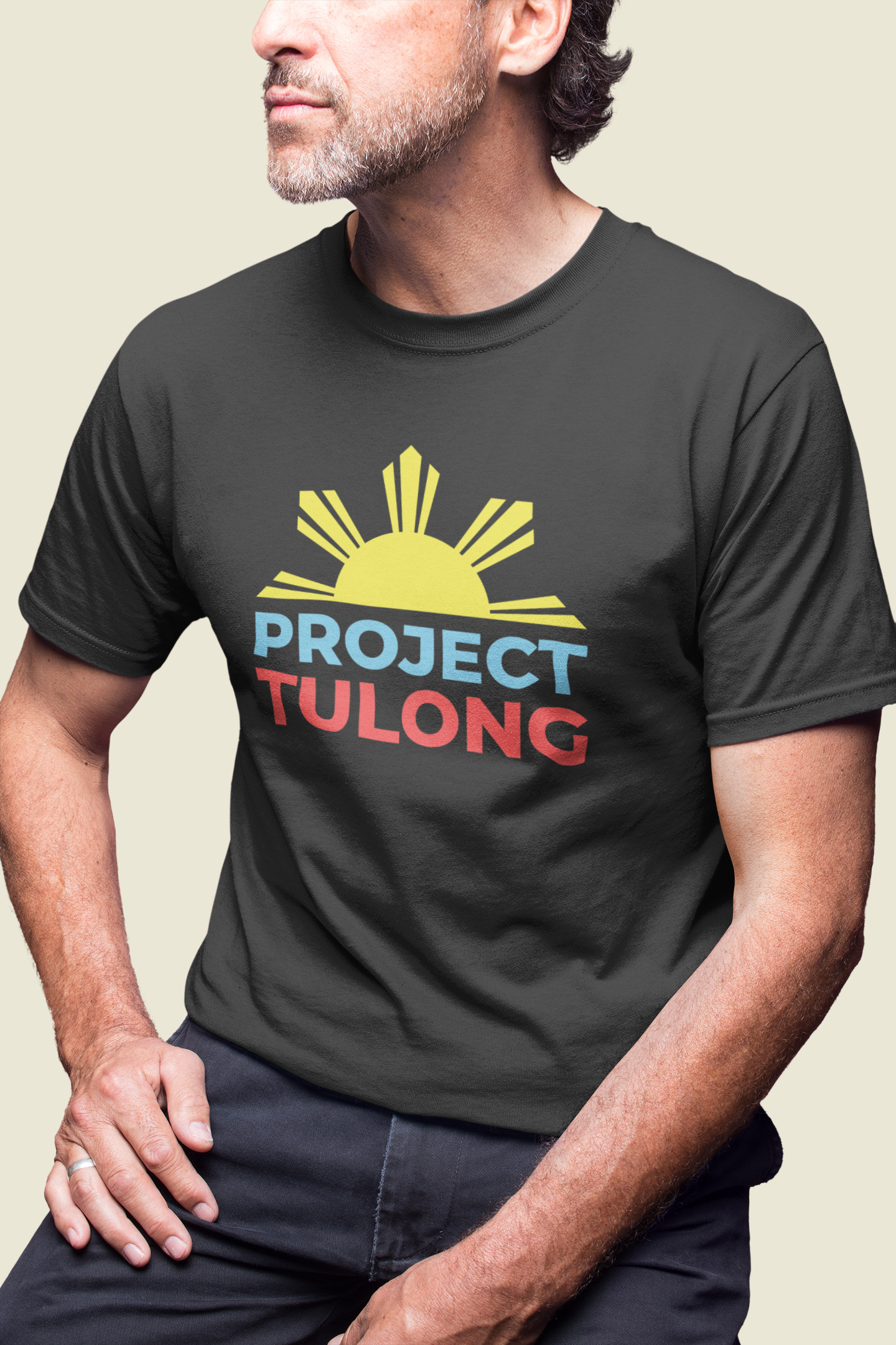
Merch Samples and Marketing Materials
