One Man Revolution Podcast
Logo Redesign & Branding
Adobe Illustrator
THE CLIENT
One Man Revolution Podcast – Orlando, Florida
PROJECT DATE
March 2021
ROLE
UX/UI and Graphic Designer
My task is to give their brand new branding and to redesign the UX and UI of their official website.
OVERVIEW
One Man Revolution is a political podcast based in Orlando, Florida. It has been around for almost 16 years; it is one of the first podcast programs that aired in 2005. The podcast started as a one-man show hosted by The Revolutionary, hence “One Man Revolution”, and in January 2016, he was joined by another host, named The Comrade. Over the last four years, they have been joined by different guest hosts, called The Travellers, who will eventually become part of the team. They mainly discuss progressive politics, but once in a while, they would also have discussions about local and imported craft beers that they all share during the show recordings.
Since the podcast started in 2005, their logo and branding had never been updated. But as the new year starts and a new volume (new season) begins, it is a perfect time for a complete redesign — 15 years later.
My job includes redesigning the branding and the website (which is discussed on this page: link to UX project here). For the branding redesign, I have created a new logo, color palette, a graphic used in merch samples, and social media posts templates.
THE DESIGN
The Logo
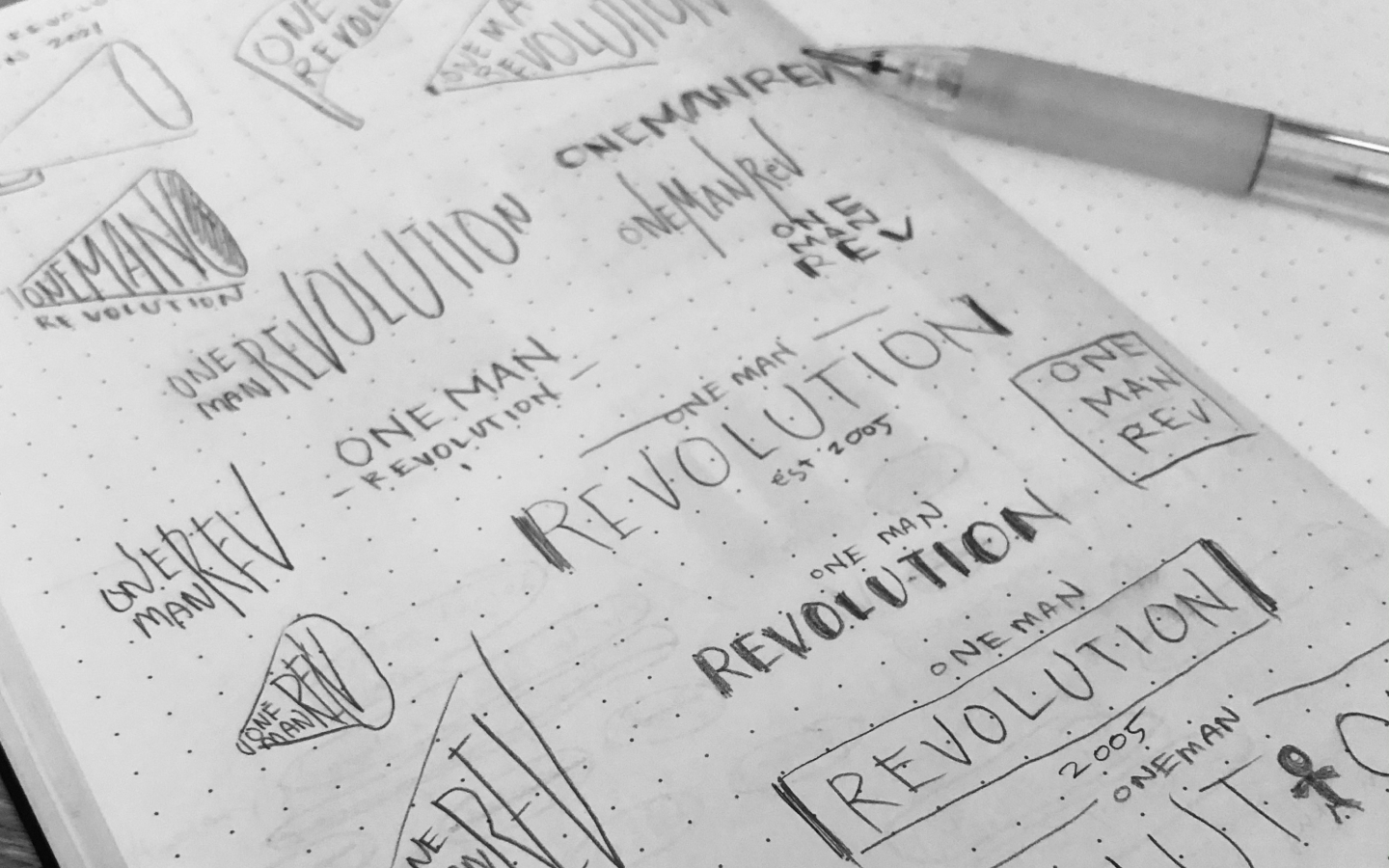
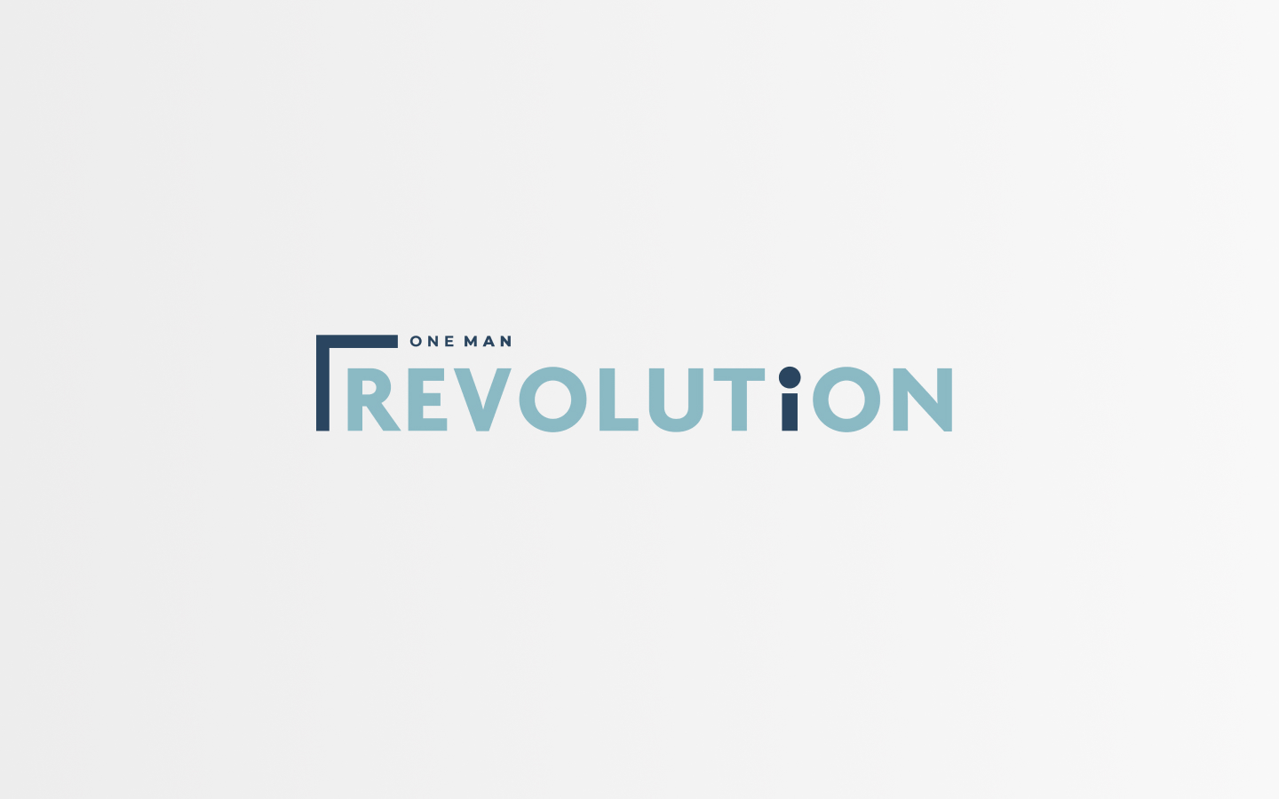
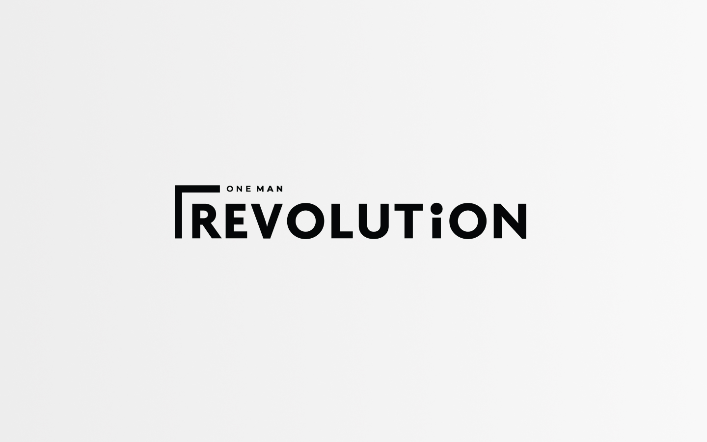
For the logo, I opted for a simple, but bold design. Since the name is long, I needed to come up with a solution where it would not be visually long in width. I also did not want to put the name in a box or a circle because the letters would be barely readable if presented small like on the website. I wanted the focus to be on the name, so I also removed all the graphics from the original logo, this way the new logo would be more flexible when put on different materials. I also chose softer and more user-friendly colors, light and dark where the dark would work as the accent color. I also made sure that the logo would also work even in black or white.
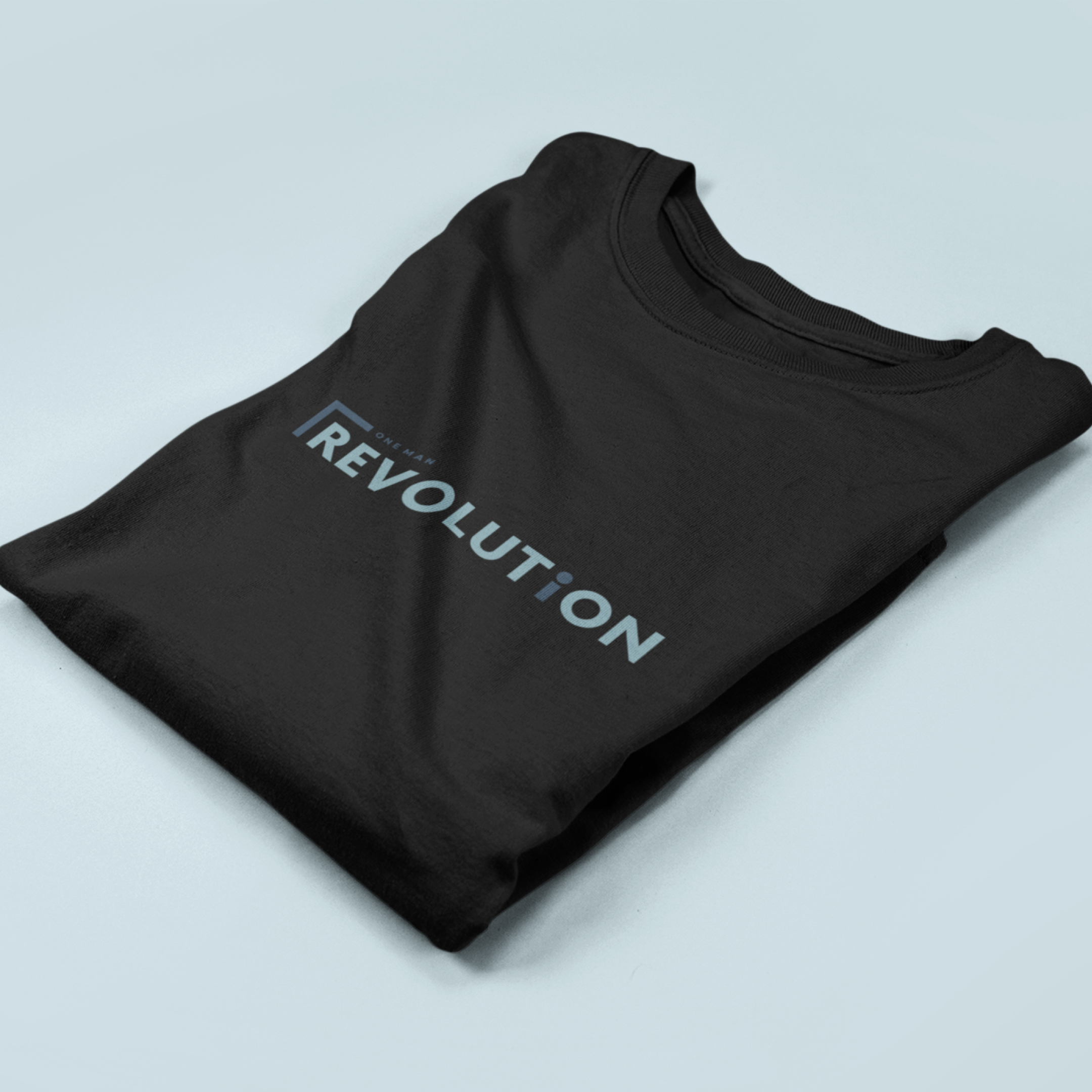
I made the lowercase “i” in the word “REVOLUTiON” to be the “accent” because it has different meanings. First, in pronouns, “I” means one person, which represents the humble beginnings of the podcast when it used to be a one-man show. Second, the lowercase “i” can also be interpreted as a person, a “one-man” where the title or the superscript dot would be the head and the vertical line would be the body. Lastly, the letter “i” can also be interpreted as a microphone since this is a podcast show. But then again, the interpretation is open and does not end with these three, it all depends on how the viewers would see it.
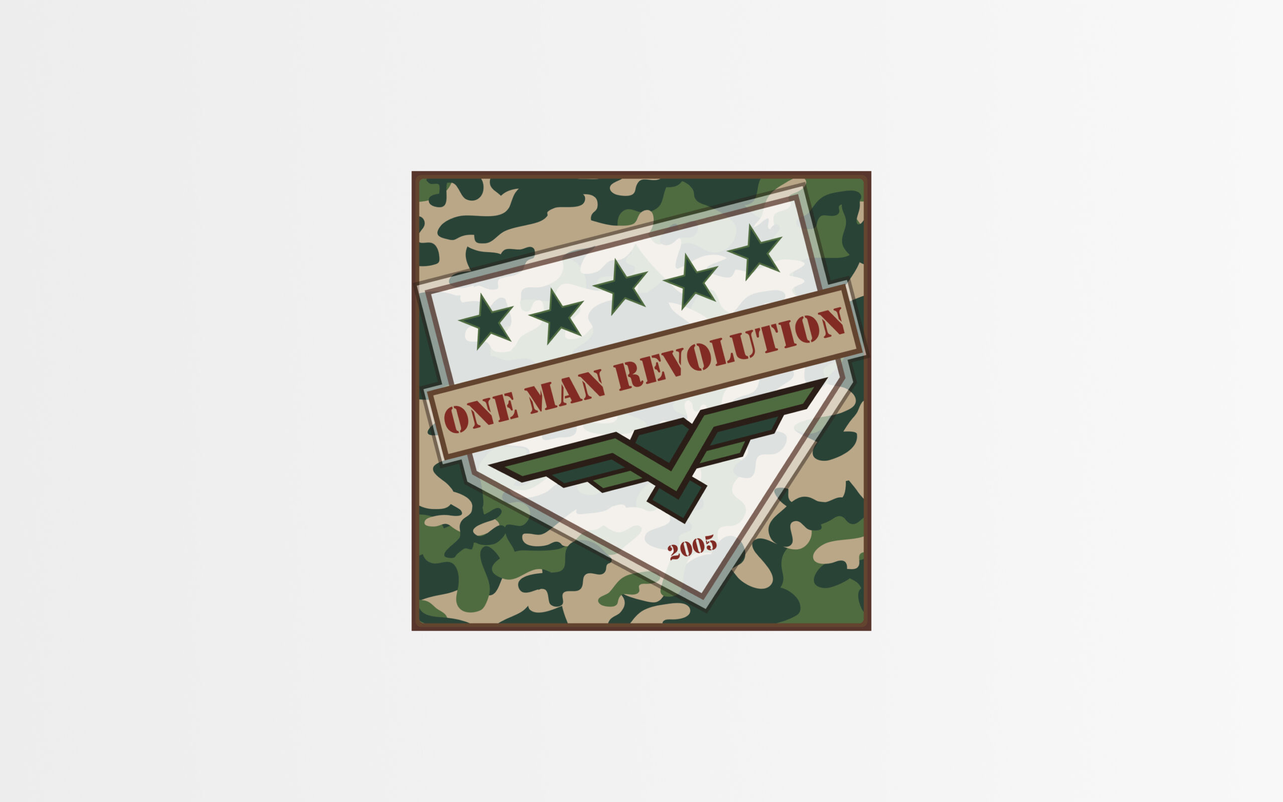
The Old Design
Here is the old logo for reference.
Graphic
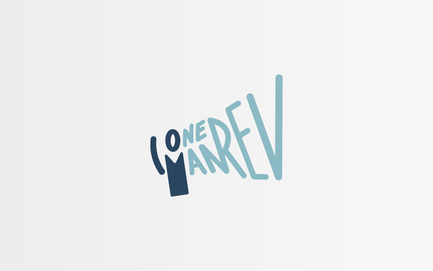
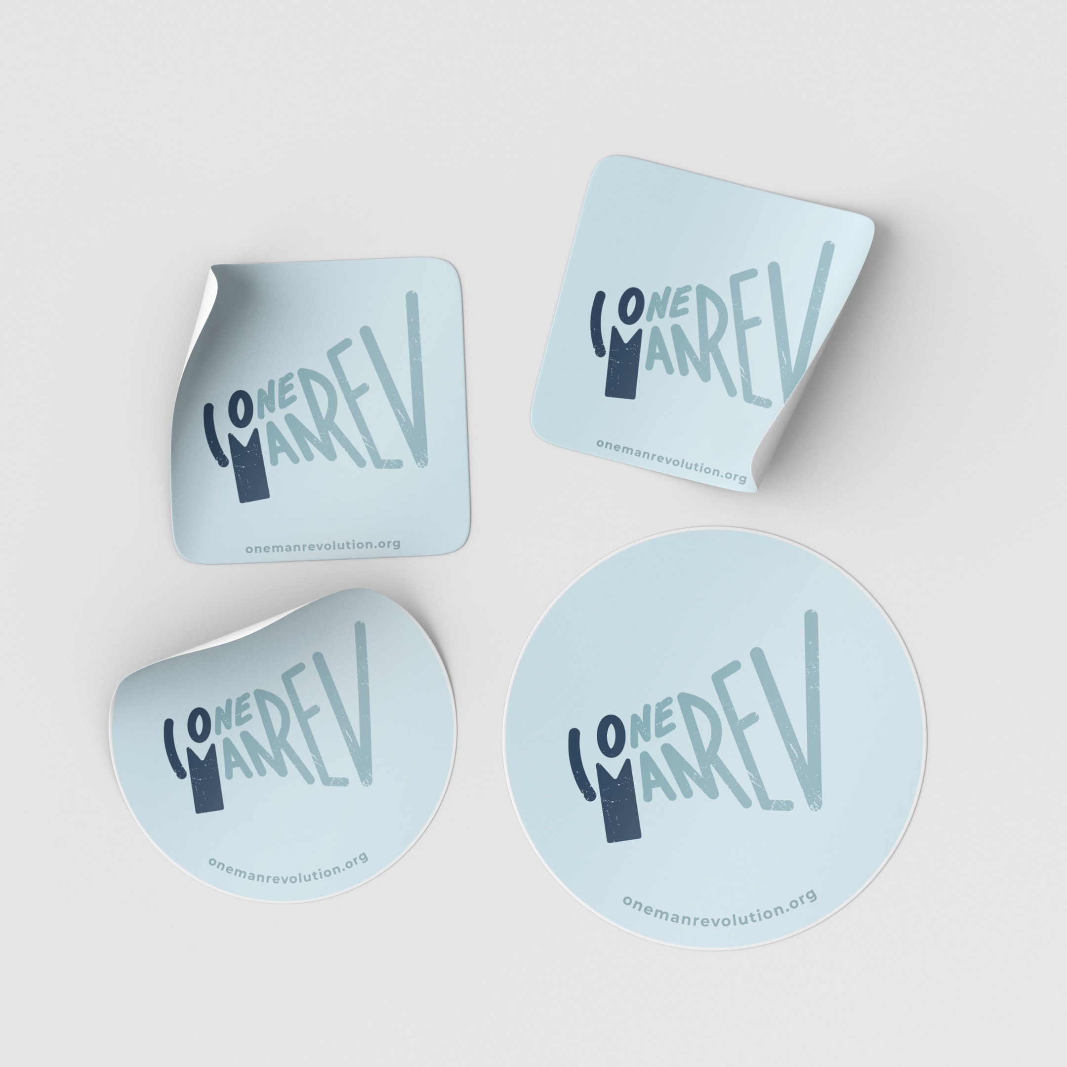
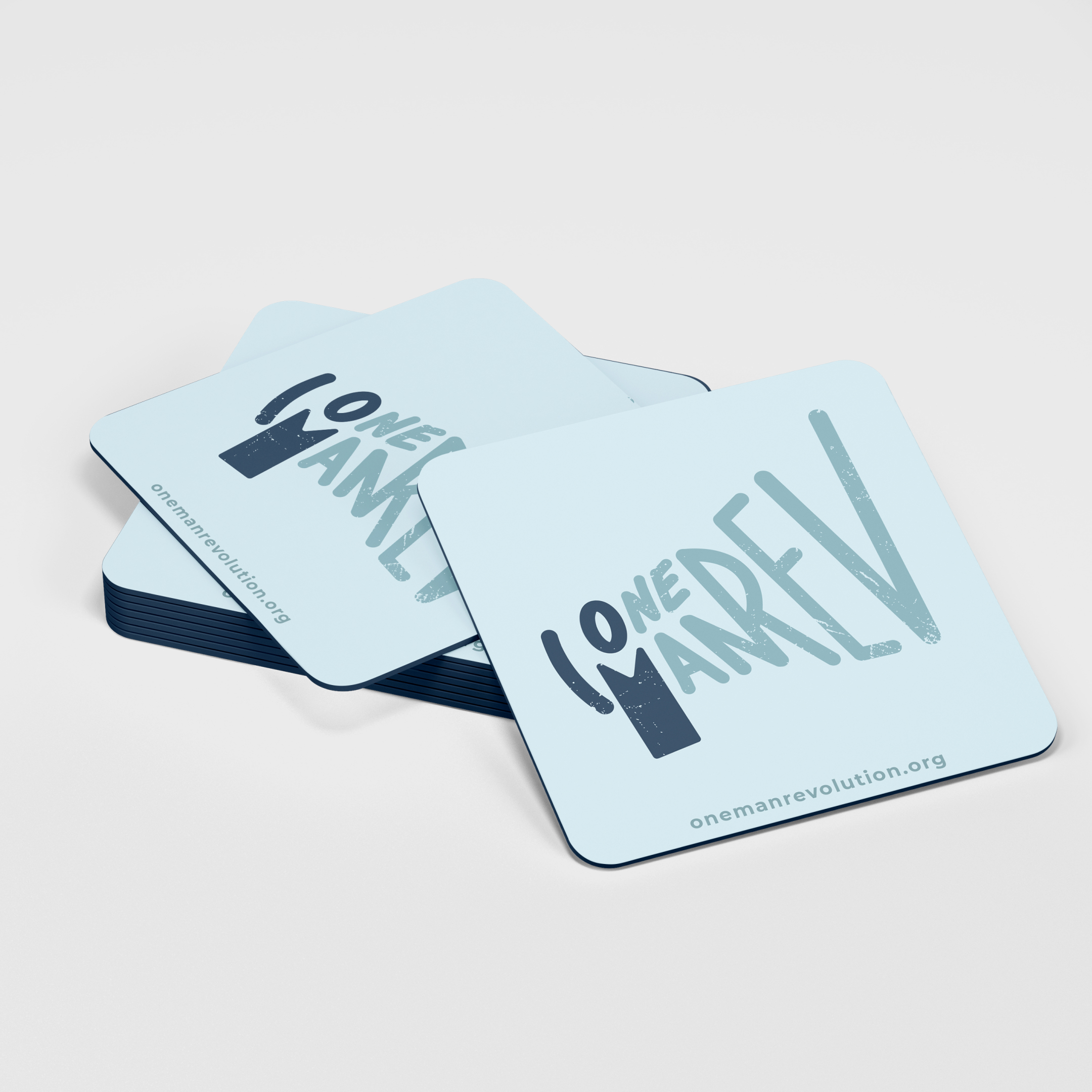
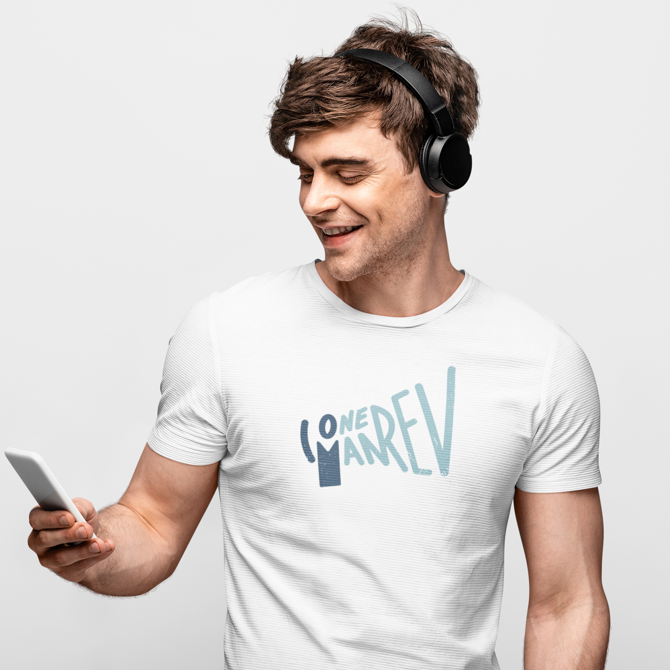
This is a simple fun graphic I made that can be used on merch and other marketing materials. This image mimics a megaphone that can be seen on how the letters were shaped and drawn — a megaphone can be a symbol for revolution and is used for saying something out loud. I drew the letter M from the word “Man” to be the handle of the megaphone; I used a dark color from the color palette to separate the O from the word “One”, the letter M from the word “Man”, and the curve line to mimic a man raising his hand.
Merch Samples and Marketing Materials
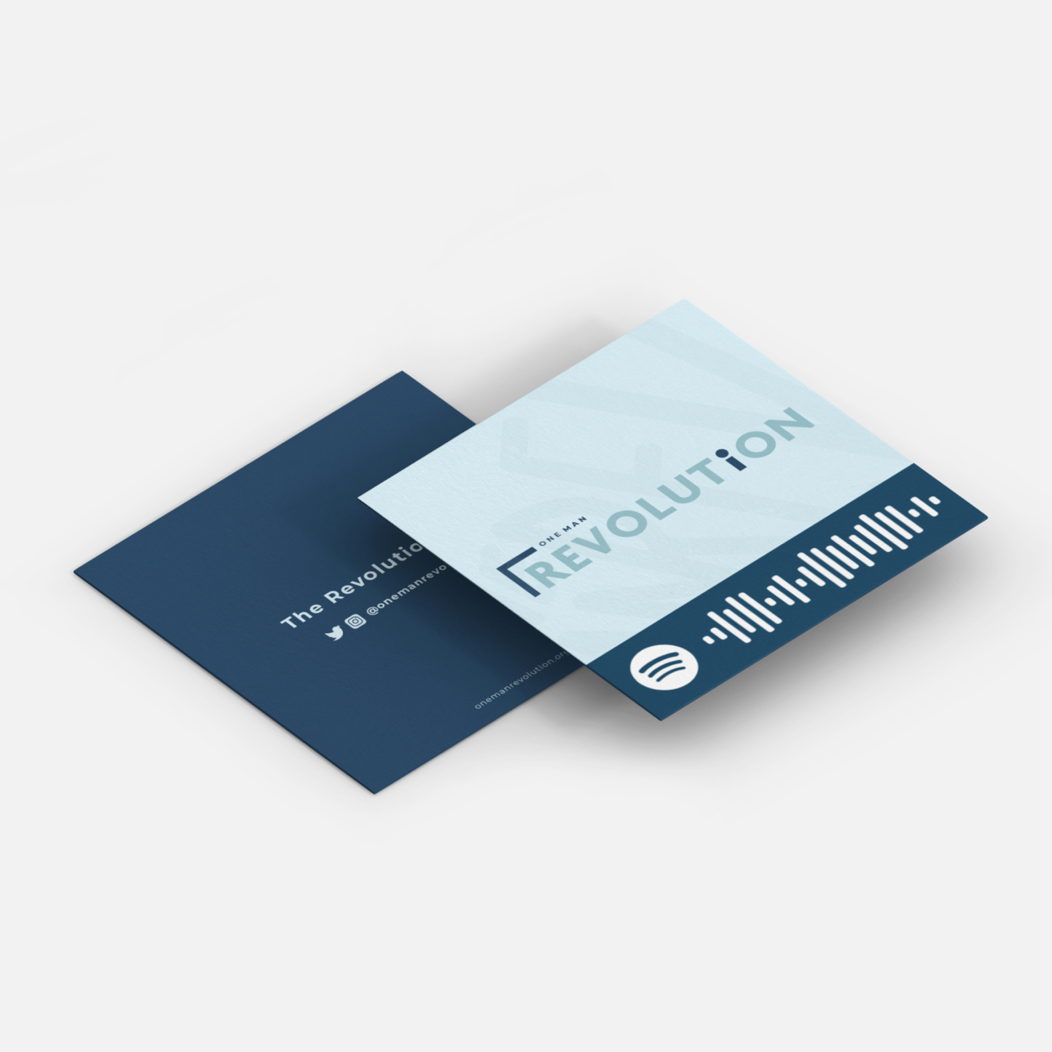
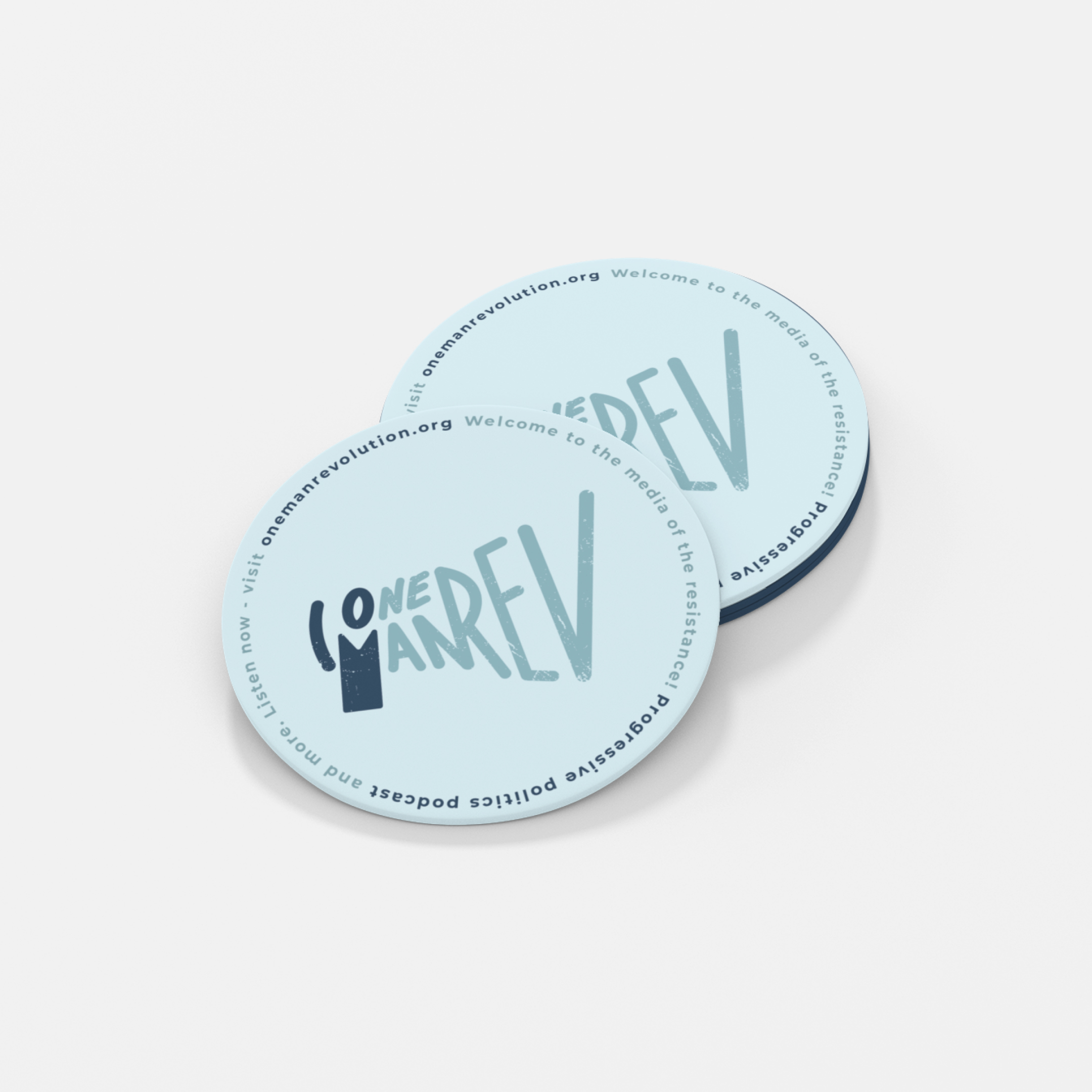
Here are some design samples for the merchandise and other marketing materials.
(business cards, stickers, beer coasters, and t-shirts)
Social Media Templates
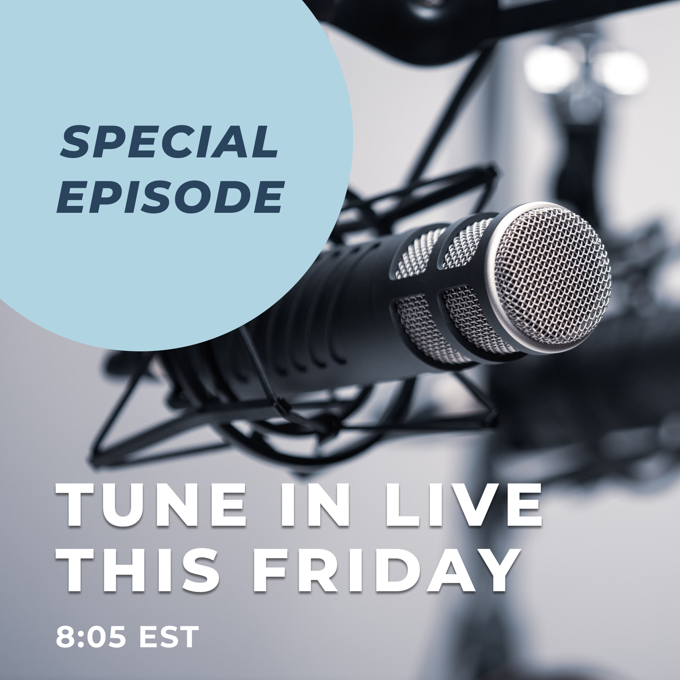
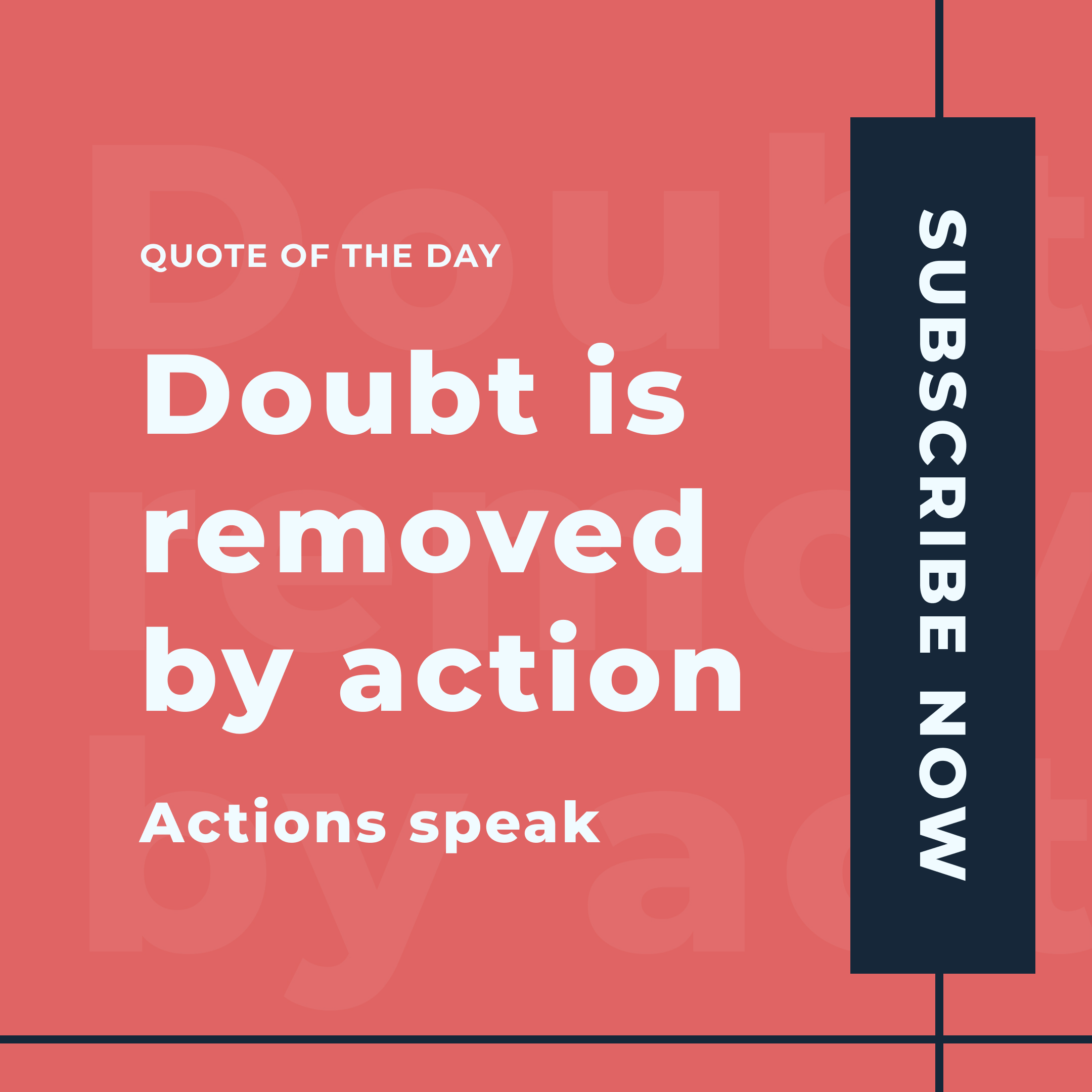
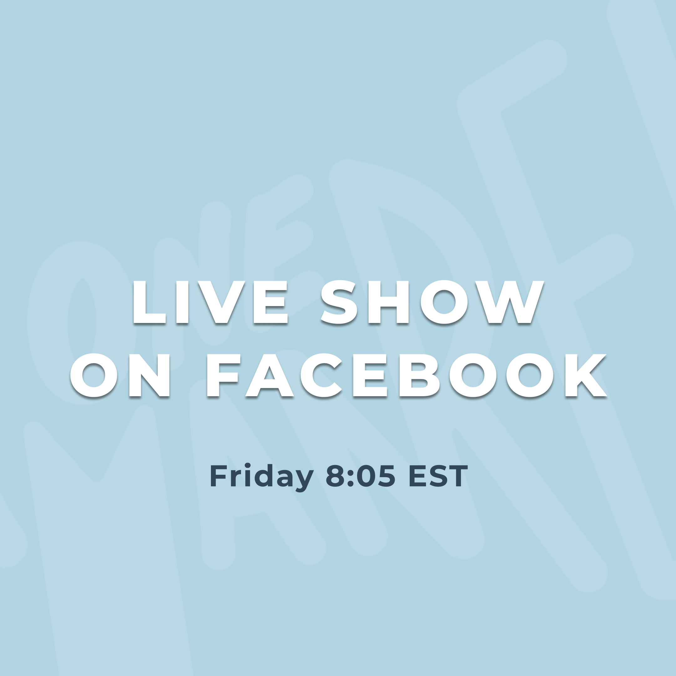
Here are some samples of daily or weekly Instagram posts. My goal when I was designing these templates was to create bolder and more modern designs that would catch the attention of the viewers.
