CARA
Logo Redesign & Branding
Adobe Illustrator
OVERVIEW
Here, I will talk about my personal brand. In the span of my career as a designer, I have made two logos and branding for myself. I created the first one when I was in college and used it to brand all my applications for internships, part-time design jobs, and eventually a full-time job when I graduated. After a few years, I feel like my old branding does not fit me anymore because I have changed my perspective as a designer and as a person, so I decided to update it.
THE DESIGN
My Old Logo
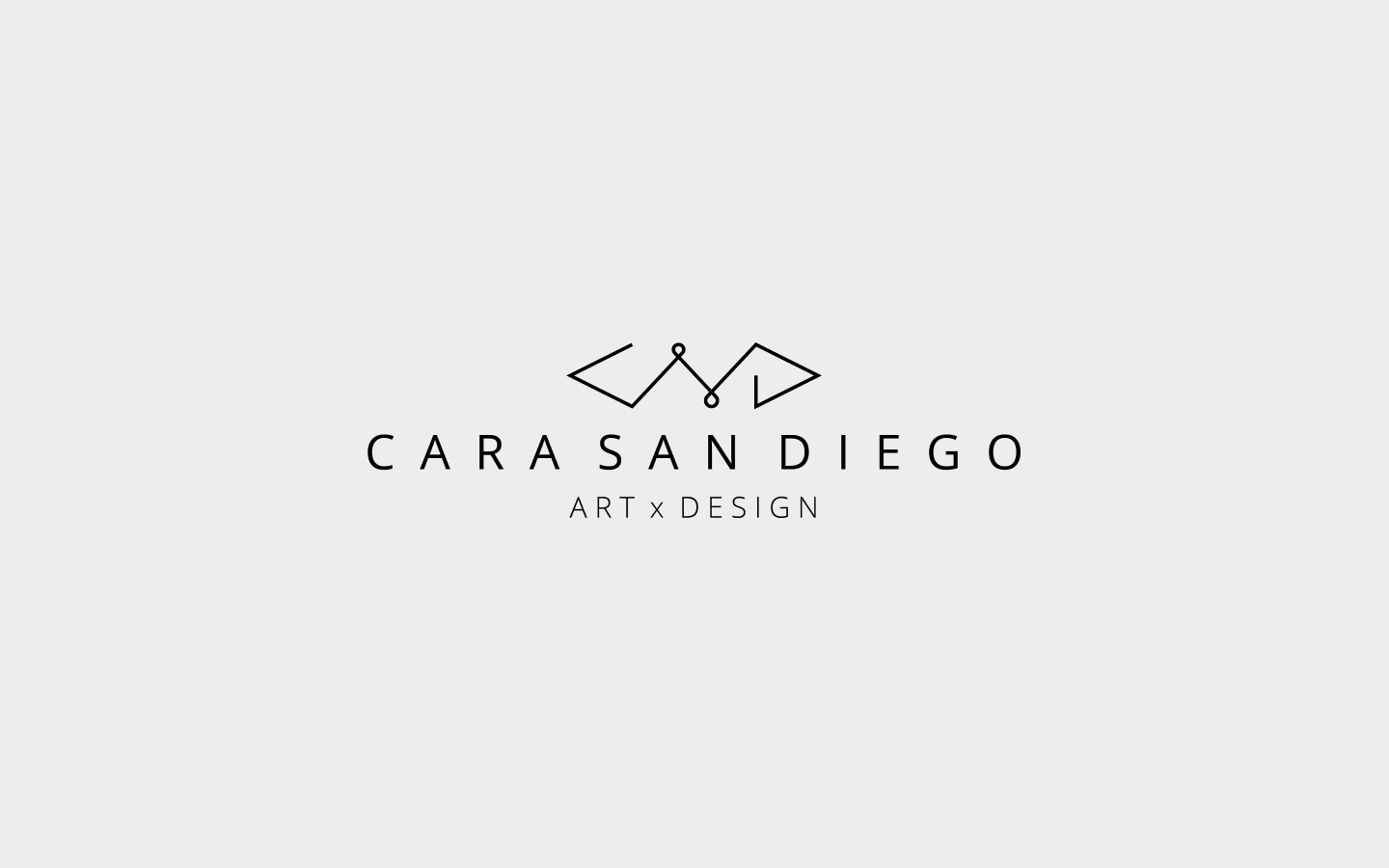
This is my old logo. Back in college, I thought I wanted to be both a designer and a front-end developer – more of like a full-stack web designer who can design and code at the same time, so I decided to create a logo that will represent both sides – I made my logo to look like an <html> tag to represent my coder side and the “art x design”, well for my designer side. When I got my first full-time job as a designer and a front-end developer, I quickly realized that that kind of job was not for me and that I was not happy, and all I really wanted was to focus on just the designer part of me because I know that that’s what I am good at and I love doing it way better than coding.
My New Logo
I eventually found a new job where I would just be doing design stuff (my current job). Over the years of working as a designer at my current job, I have learned a lot of things I really did not learn in college. I learned it by working with an amazing team, by reading books and articles, watching other designers’ stories, and by simply experimenting on my own – I learned that I do not know everything yet and that I need to keep on growing every day – and those things have changed my perspective not only as a designer, but also as a person.
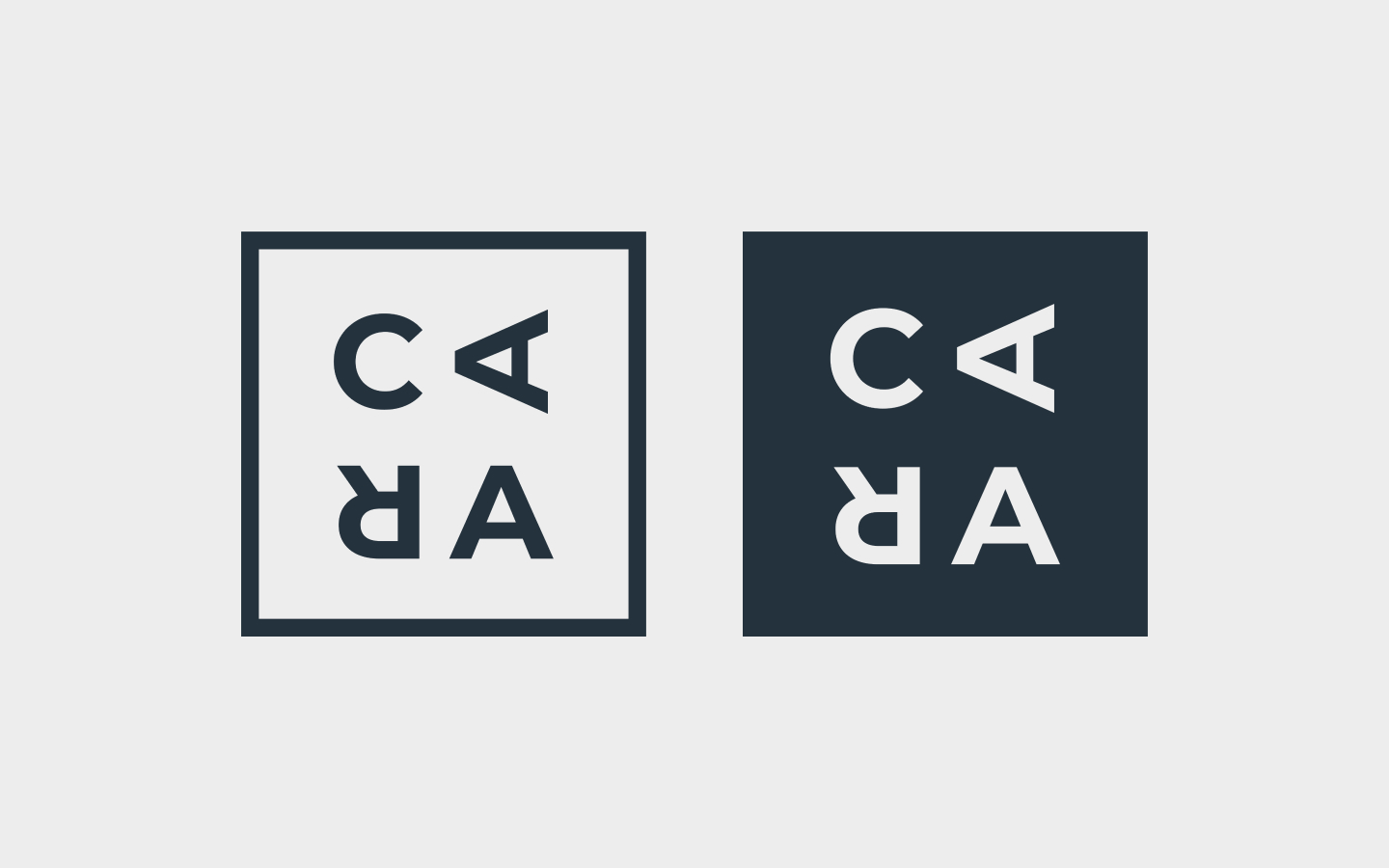
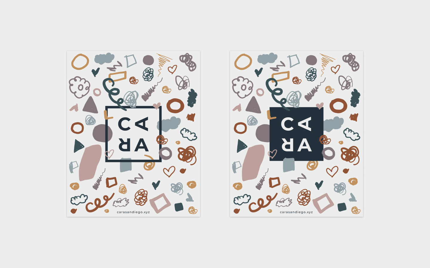
For this new design, I really want it to be simple, minimal, and sharp, but also playful. I want it to represent, not only what I do, but also my personality. If you look at it, there is really nothing special about it, it’s just my name with a square border – but there’s really more into it. First, it is my name – nothing fancy, I just need to represent myself, that is all. Second, it has a square border, I could have put a circle around it, or a rounded square, but I needed it to be sharp, perfect, and even because I am a perfectionist, however, I flipped the two letters on my name because I am also not perfect – I do not know everything and I will always keep on learning. Another reason why I chose a perfect square is that it is an ode to the good old reliable sticky notes where the entire process of UX design begins.
Graphics
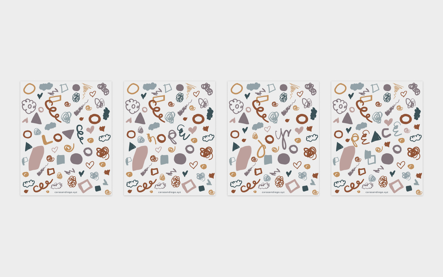
Here are some more graphics I made on Adobe Draw to pair up with my logo; I “subtly” drew four words on there – the four things I want in life:
(see if you can find them.)
Here’s my logo paired with the graphics:
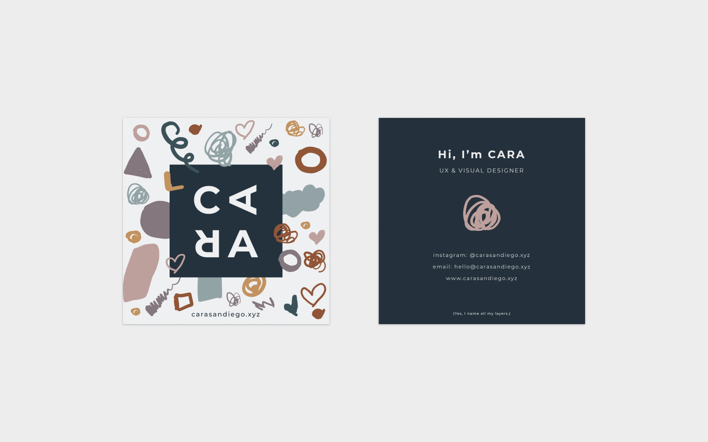
Next is my business card design:
Last, but not least, my sticker designs:
