Project Tulong Website
UX/UI Design
Figma
THE CLIENT
Project Tulong – Orlando, Florida
PROJECT DATE
March 2023
ROLE
UX/UI and Graphic Designer
My task is to design the logo and the UX and UI of their official website.
OVERVIEW
Project Tulong is a non-profit organization established in 2022 in Orlando, Florida. The word ‘Tulong’ means help in Tagalog, the native language in the Philippines – their goal is to help the people from the less fortunate cities in the Philippines.
In December 2022, the founders, a married couple, Kristine and Winston, visited the Philippines and had the opportunity to share their blessings. They were able to donate 185 food bags and 325 school supplies to the children of a local community including an orphanage located in Kristine’s hometown. It was a very meaningful experience for them and they wanted to continue this every year as a tradition, so they decided to turn this into a non-profit organization and called it Project Tulong.
THE DESIGN
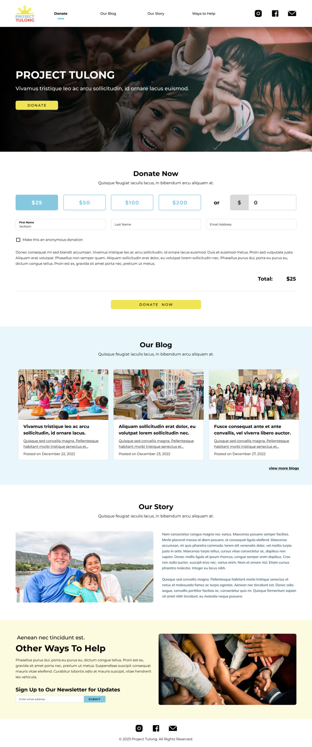
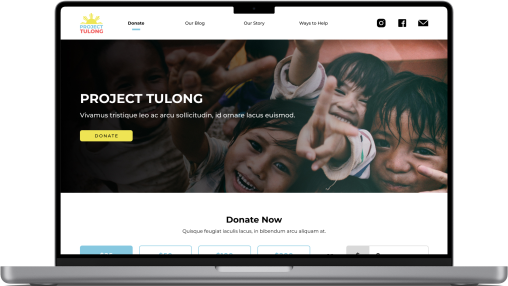
This is the Project Tulong website. The clients wanted it to be a one-page parallax design. They wanted to be a simple page that has a donate section, an about us section, and a blog section where they can post updates about the foundation.
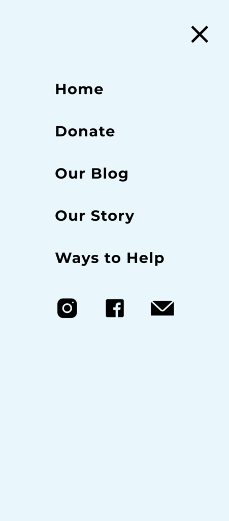
What I did here is I divided the site into four sections – Donate, Our Blog, Our Story, and Ways to Help (I added this additional section and it was not on the original request); these four items are all accessible on the navigation. Since there was some space on the header, I put their social media and email links on the top right for easy access and to balance it out with the logo on the top left.
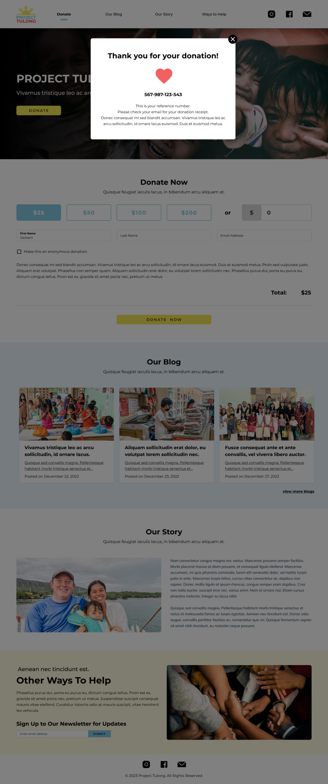
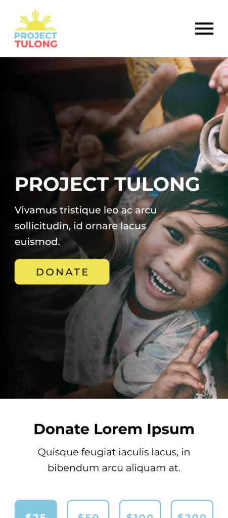
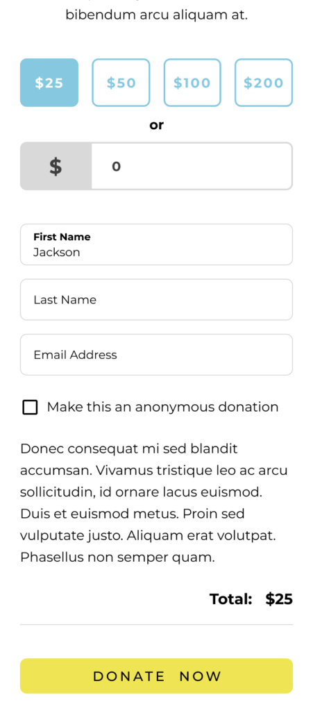
The hero banner features a large image and the hero text with the first donate button that will smooth-scroll to the Donate section. Users have the choice to donate $25, $50, $100, or $200, or they can type in a specific amount. Under the “select amount” section will be the name and email address section – they also have the choice to make the donation anonymous. Once the donate button is clicked, a confirmation pop-up will appear this will show the reference number; if they had provided an email, they will also receive a confirmation message that would also include the reference number. If they had put their name but did not provide an email, they will only get the reference number through the pop-up, but their names will be recorded backend. If they opted for an anonymous donation, they will be given a reference number through the pop-up; anonymous donors will always be anonymous, and even the organizers will not know them unless the donor shows the reference number. This will help with the tracking and recording of the donations.
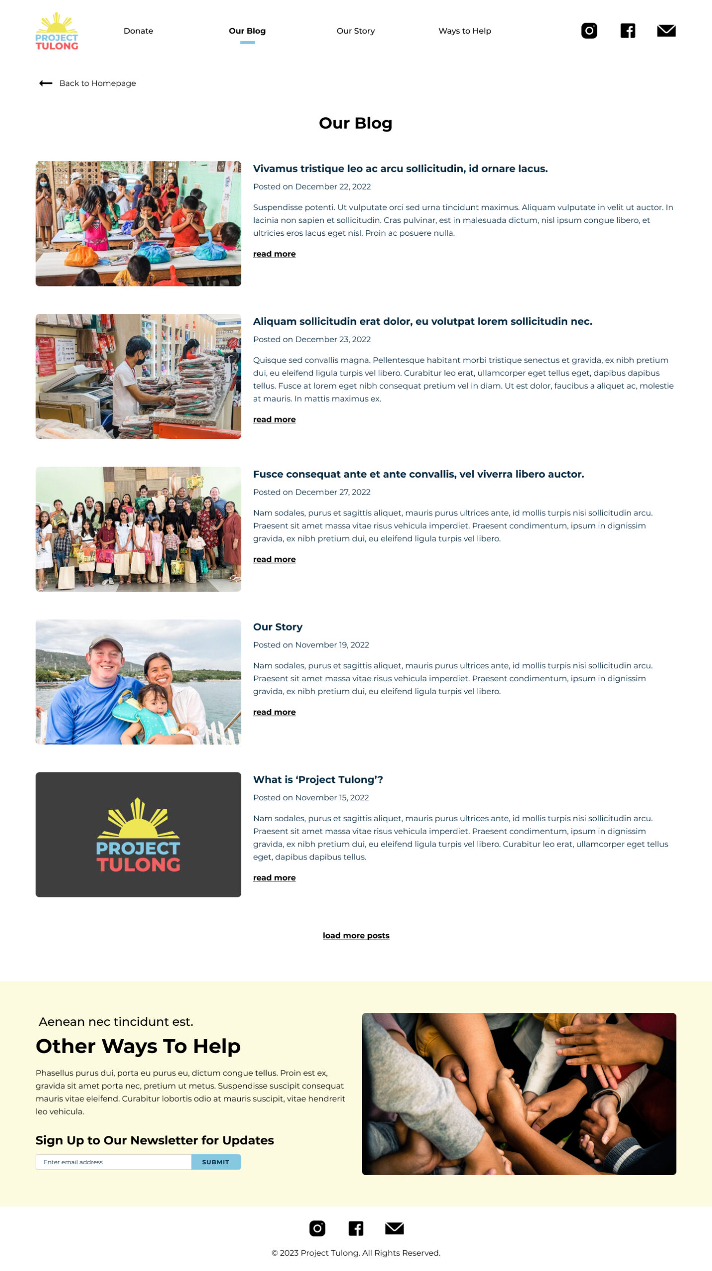
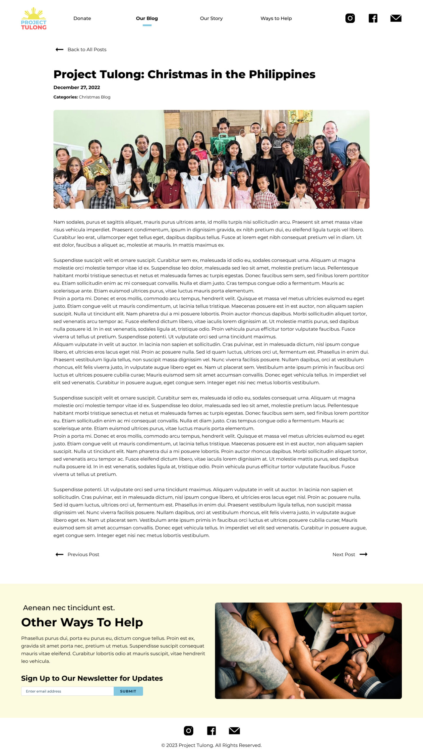
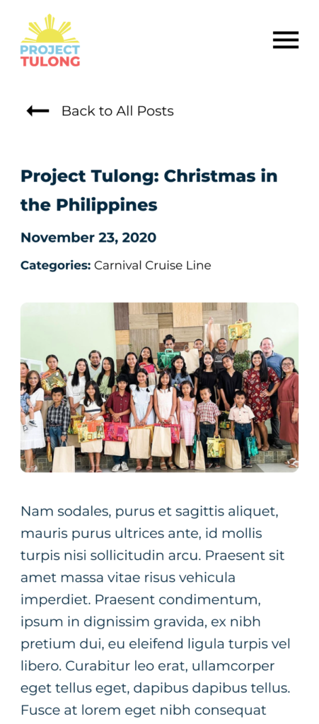
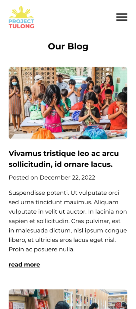
The Blog section features the three latest blogs. There is a link that will take the users to the blog list page and each blog post link will open to a new page where users can read the whole blog.
The About section features the founders’ photos and their vision, mission, and story.
The last section is the Other Ways to Help where the other ways to donate are listed just in case some people did not want to donate through the website. Users can also sign up for the newsletter in this section. This section will always be present on all of the pages, so the users will always see this information even if they are not on the homepage.
Lastly, I also placed the social media and email icons on the footer, so users can access them if they are viewing the bottom of the page and they would not have to scroll up to the header to access them.
This website design is responsive and mobile-friendly and accessible on all devices.
Desktop View
(this image carousel has 4 slides, click on the image to open the gallery)
Mobile View
NEXT STEPS
This project is in the development process.
NOTES
*I do not own the images – credits to Unsplash. For the Blog and About Us images, credit to Kristine Card.
