One Man Revolution Podcast Website - A Case Study
UX/UI Redesign
Figma
THE CLIENT
One Man Revolution Podcast – Orlando, Florida
PROJECT DATE
March 2021
ROLE
UX/UI and Graphic Designer
My task is to give their brand new branding and to redesign the UX and UI of their official website.
OVERVIEW
One Man Revolution is a political podcast based in Orlando, Florida. It has been around for almost 16 years; it is one of the first podcast programs that aired in 2005. The podcast started as a one-man show hosted by The Revolutionary, hence “One Man Revolution”, and in January 2016, he was joined by another host, named The Comrade. Over the last four years, they have been joined by different guest hosts, called The Travellers, that eventually became part of the team. They mainly discuss progressive politics, but once in a while, they would also have discussions about local and imported craft beers that they all share during the show recordings.
The podcast is available on different platforms like Spotify, Google Podcast, Apple Podcast, TuneIn, YouTube, and its official website, onemanrevolution.org.
THE SCOPE
The scope of my work for One Man Revolution Podcast includes redesigning the entire branding; creating a new logo and a new color palette, redesigning the UX and UI of their website and making sure that it will work on both desktop and mobile devices, and lastly, designing marketing materials that would help promote the podcast and drive traffic on the site.
THE CONSTRAINTS
One Man Revolution is a small organization. I will be the only one doing this project. They also do not have enough resources to do heavy research, so I only worked with Google Analytics data, social media interactions, and user comments that they have provided me.
USER & AUDIENCE
In One Man Revolution, they discuss progressive politics, they share insights and honest opinions about what is happening in the government; they also talk about the promises made by the current administration and if they are keeping them – they want to be heard. They aim for a wide audience, not only those who are politically active, but especially those who are not – their listeners are an equal mix of male and female listeners, targeted at 25-54 years old. The age range is very wide – so the design needs to accommodate all ages.
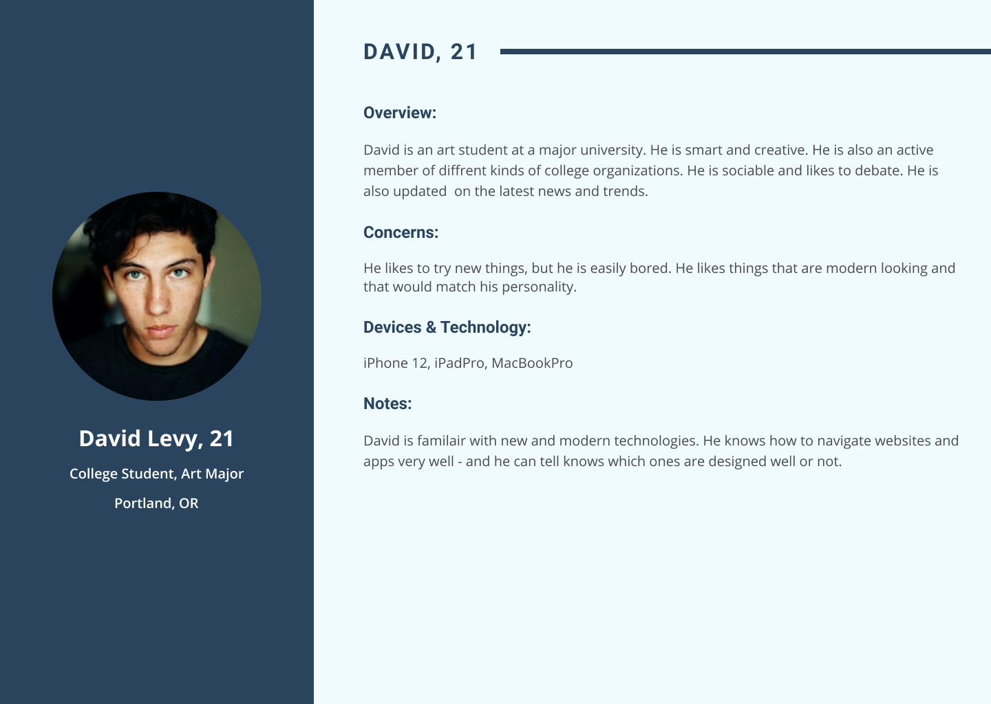
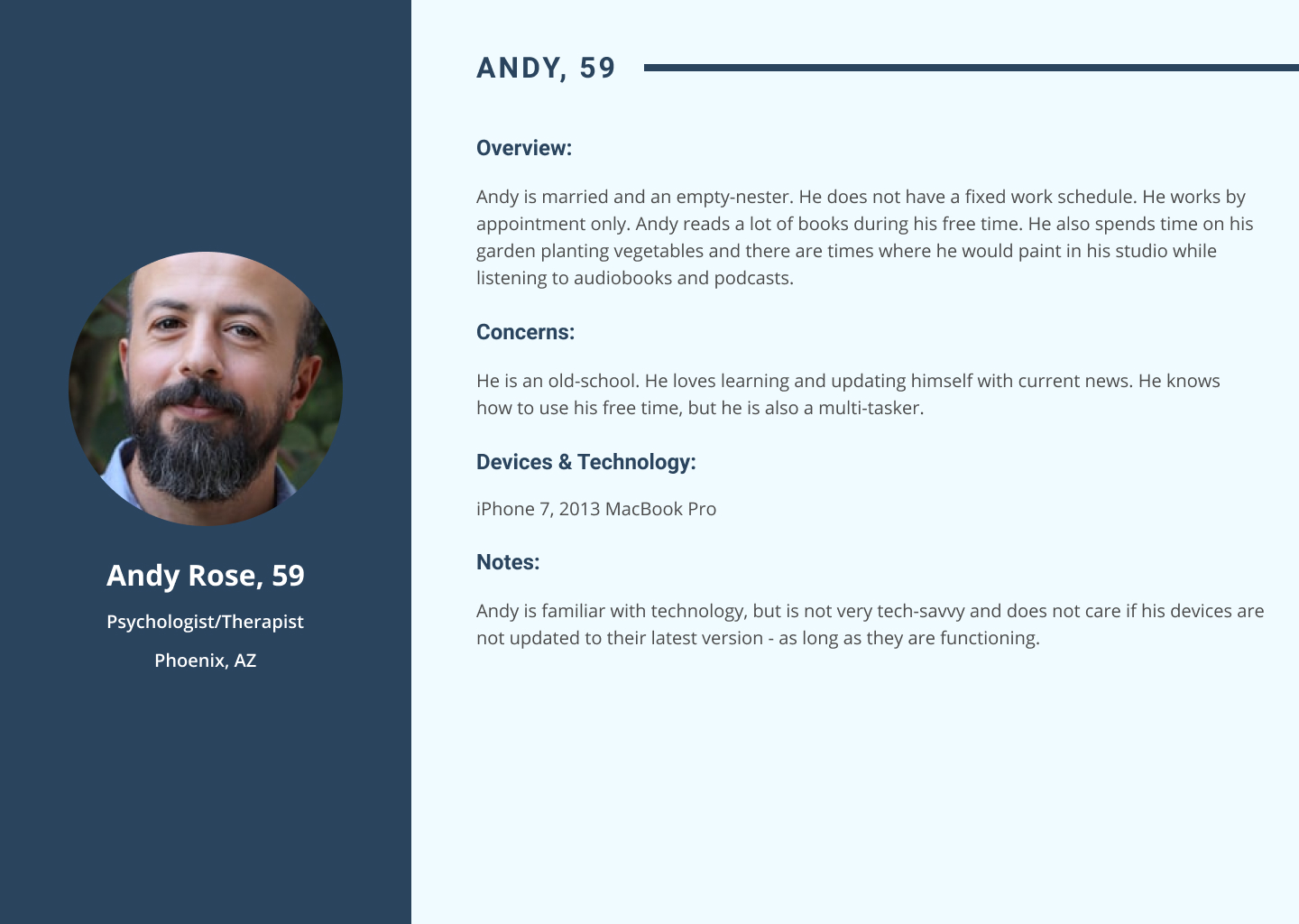
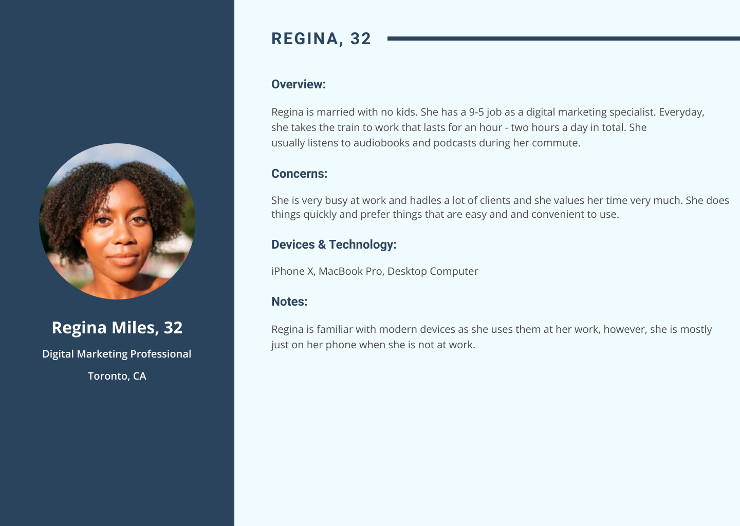
Personas
Who are we designing for?
One Man Revolution is a small organization and does not have enough resources to do heavy research, so I just based these personas on Google Analytics data they have provided.
(this slide has 3 images)
THE PROCESS
I. UNDERSTANDING THE PROBLEM
Why does it need a redesign?
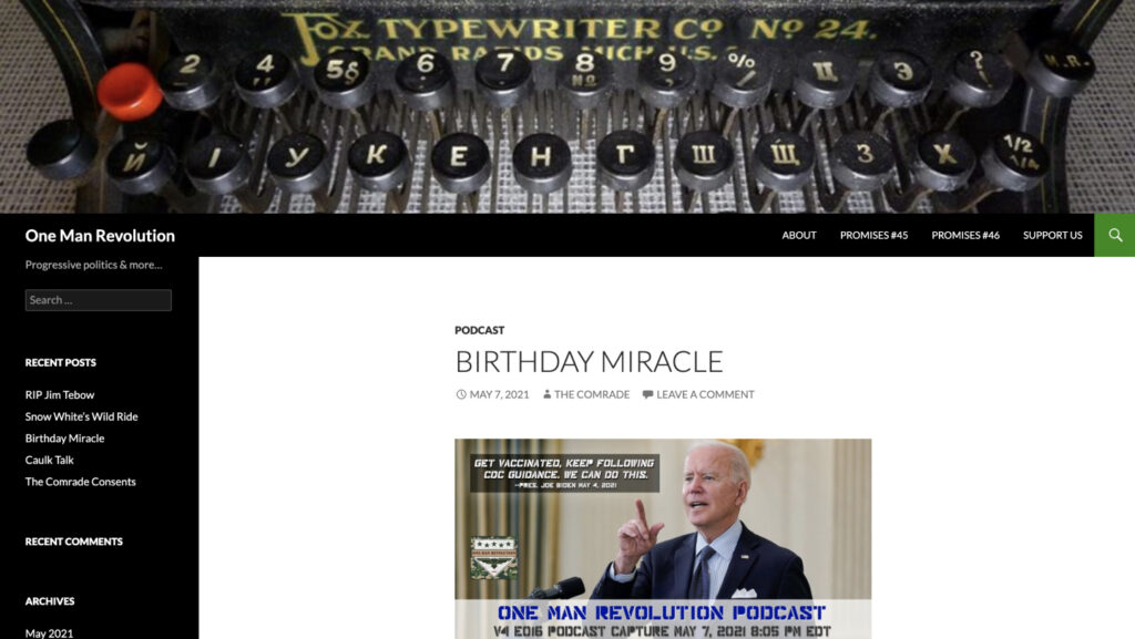
One Man Revolution uses a basic WordPress blog theme for their website. Aside from their logo, nothing on their website represents their brand. It does the job of compiling the episodes, links, and show notes, but it is very easy to get lost on the site. It is also outdated in style and does not work properly on certain devices like phones – which is a big problem for a podcast website. The website works but does not provide an “experience” to its users (listeners).
(Here’s the old One Man Revolution website for reference)
II. IDENTIFYING PAIN POINTS
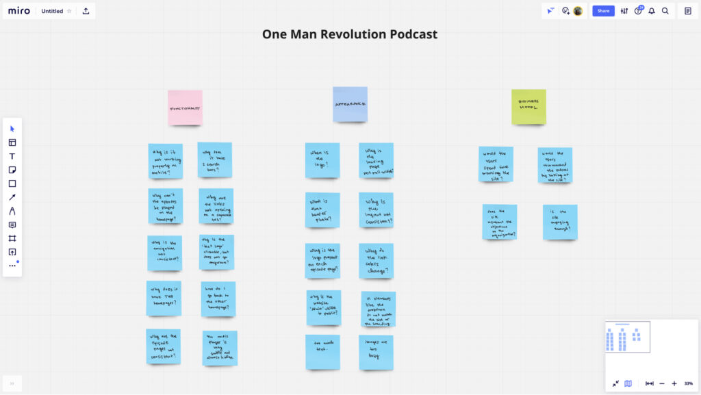
These are the pain points that need to be solved. These include problems with appearance, functionality, and business model.
(Image screenshot from miro.com)
Pain Points:
- The branding cannot be seen on the website. The logo is present on some pages, but not across the site
- The navigation is not consistent across the site
- The pages are also inconsistent; there are two homepages and two kinds of episode pages
- Once the users leave the ‘first’ homepage, there is no way to go back to it aside from typing the url again
- The imagery is too busy with the extra graphics on it
- The website is not mobile-friendly
- The homepage is not full-width like the rest of the site
- The podcast episodes cannot be played right away – they can only be played on the episode page
- The website layout is also inconsistent and needs to be organized
- There are unnecessary UI elements on the site like the two search bars on the homepage
- The website is text-heavy and link-heavy
- The links do not open on separate tabs
III. GOALS
Here are the things that need to be accomplished by the end of the process.
Goals:
- The branding (logo and brand colors) should be seen and utilized on the website
- The navigation should be consistent and accessible across the website
- There should only be one homepage – and it can be accessed from any page
- Use better images that will fit the branding and are not distracting
- The website should be mobile-friendly – it should work on all kinds of devices
- The website should be usable by users of all ages – the ones who are familiar with technology and those who are not
- The website should be ADA-Compliant
- Users should be able to listen to episodes wherever they are
- Users should be able to access the audio controls and play the podcasts episodes from across the site
- Web layout should be consistent and organized across the site
- Remove all unnecessary UI elements and links
- The links should open on a separate tab
IV. SOLUTION
Information Architecture and Navigation
Old Navigation:
The first thing to do is rebuilding the structure of the site. The old site has two kinds of navigation being utilized – when the users land on the page, there is a navigation with four items on it (About, Promises #45, Promises #46, Support Us, and a clickable “One Man Revolution” text) When the users are directed to the episode links, the navigation changes from four items to two that includes Home (this is different from the Homepage where the users land when they go to the URL: onemanrevolution.org) and Archive (this is a dropdown that shows different categories of the podcasts – but most of them just give the same exact list).


New Navigation:
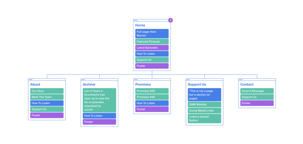
The website would now have one navigation. There would be five items on the navigation list and each would go to its own page except for the Support Us section that would be part of some pages. The new architecture is simpler, consistent, and accessible on all pages.
(The pages will be talked about later on the mockups section)
(Image screenshot from octopus.do)
The New Design
Wireframes
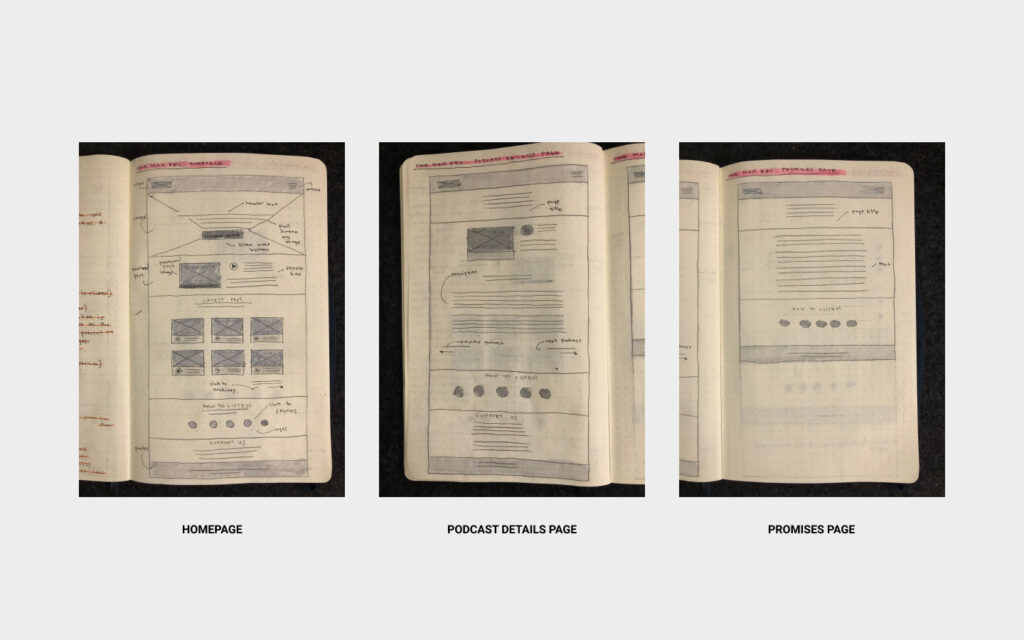
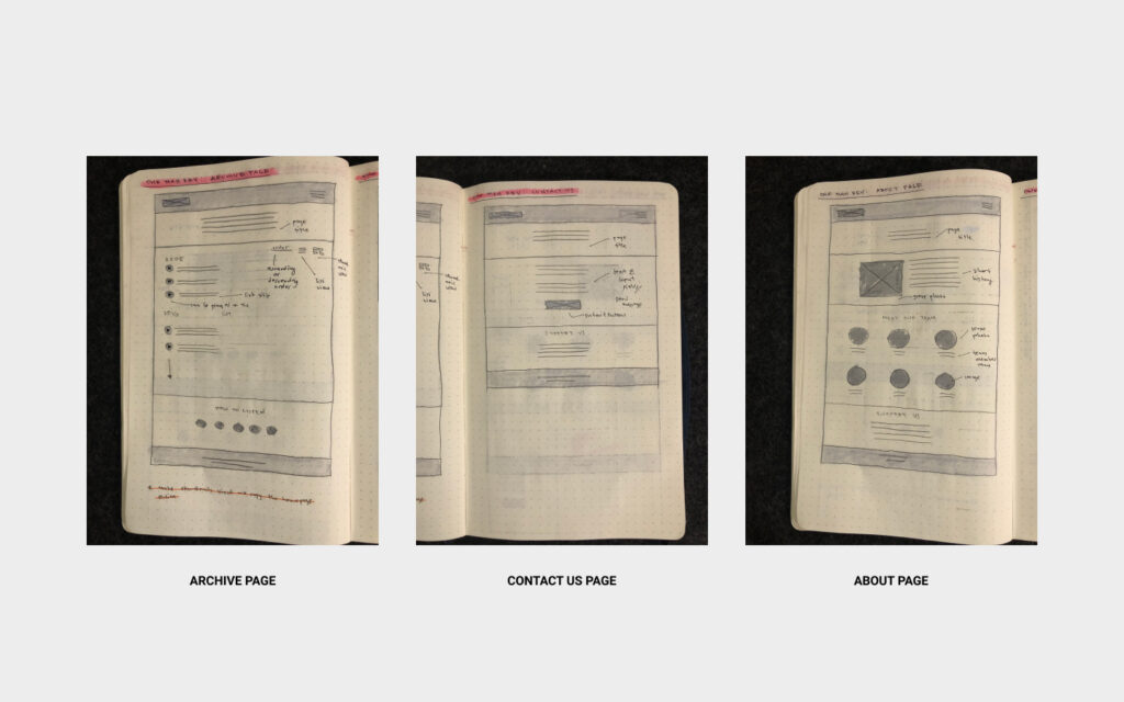
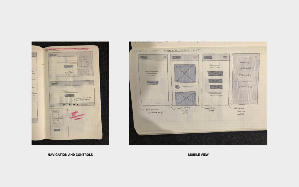
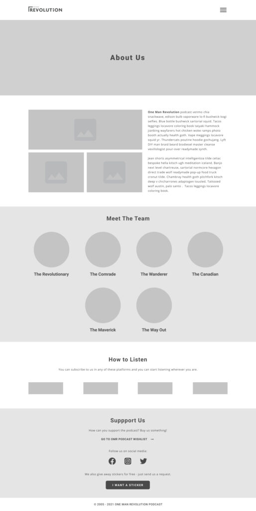
This is the initial plan for the website’s layout – the earliest stage of the process. These wireframes show the new sections that each page would have and how the elements and the new navigation would work.
Medium-Fidelity Prototype
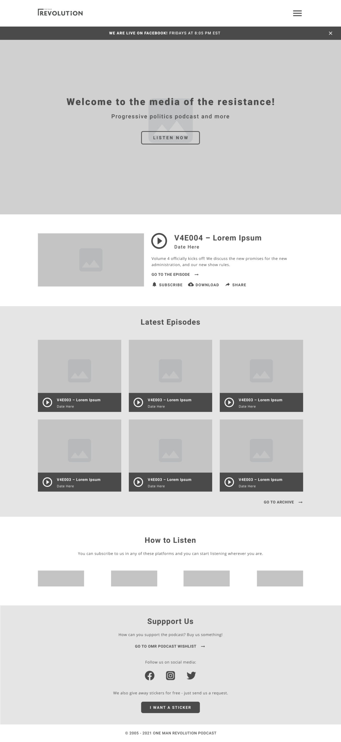
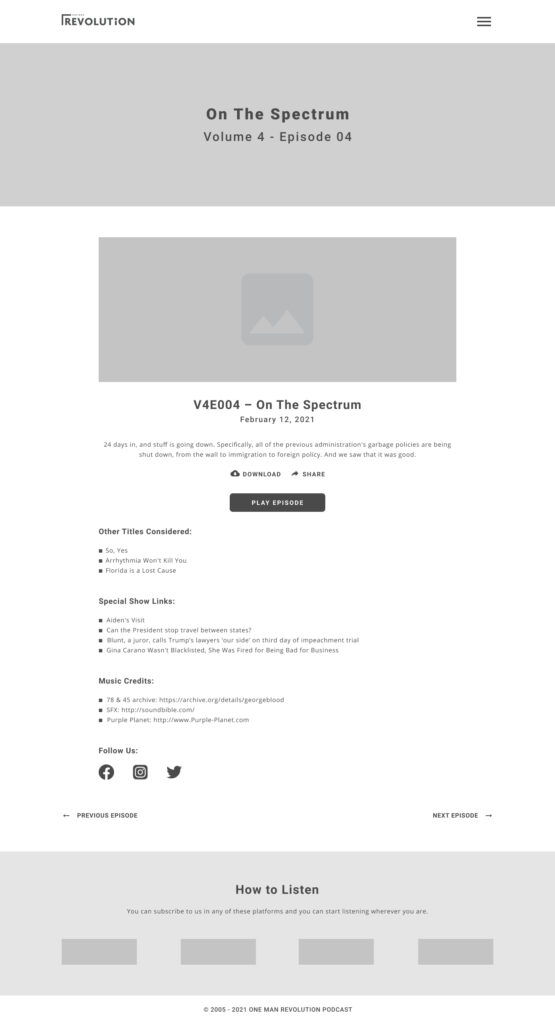
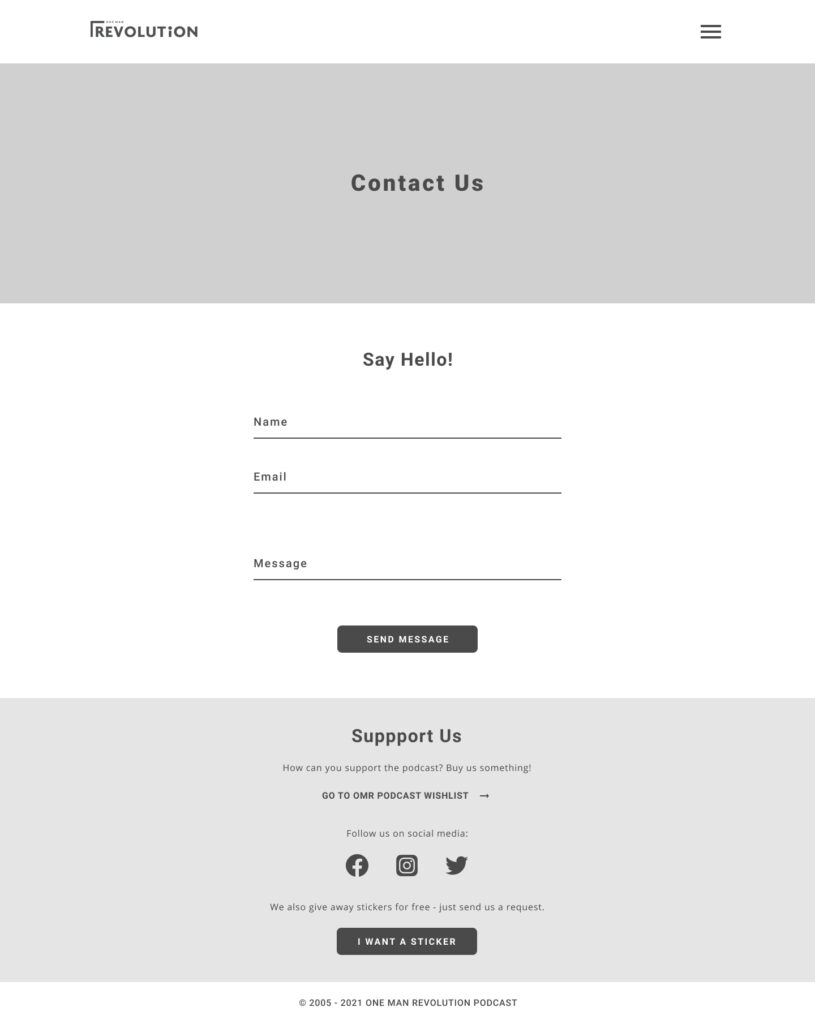
These frames are more detailed and show the key elements of the websites and how they would work.
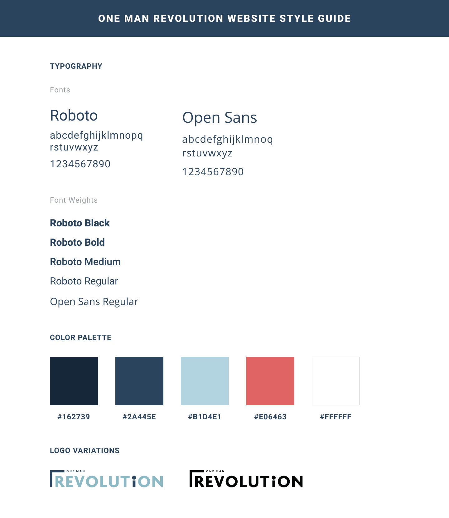
Style Guide
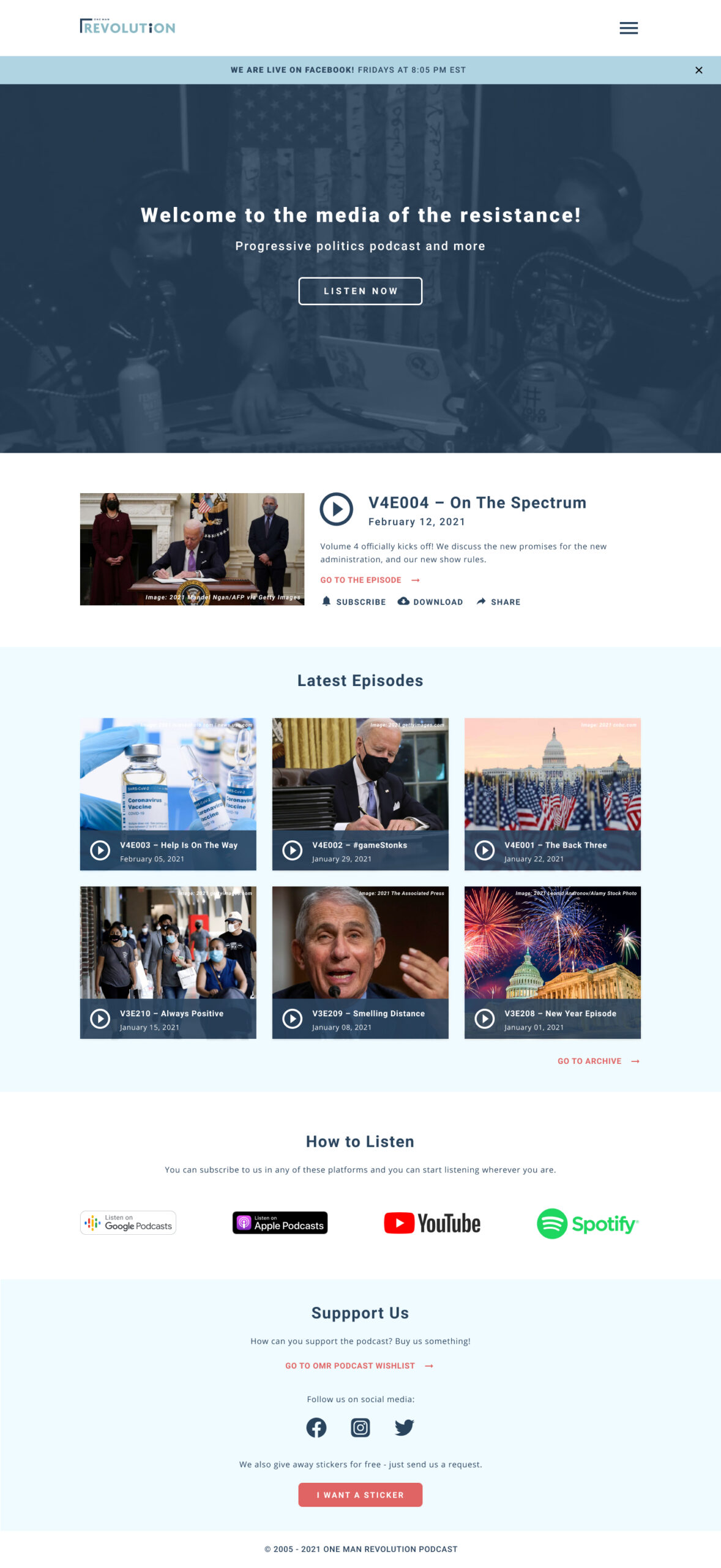
Homepage
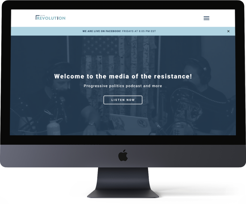
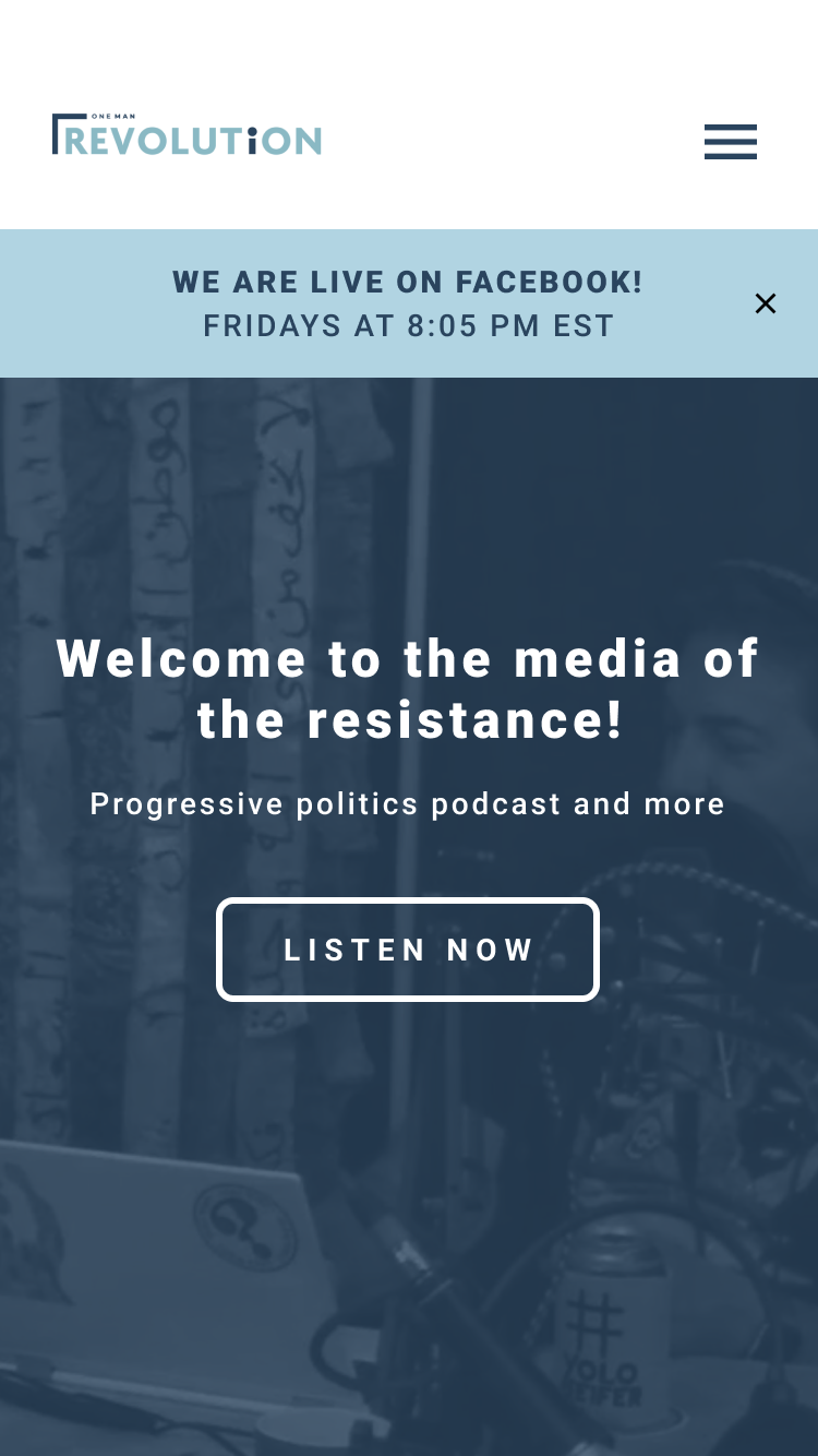
This is the new homepage of the One Man Revolution Podcast Website. It has five sections:
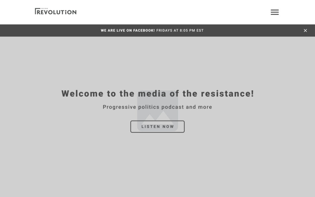
- The header that includes the logo and the hamburger menu that would open up the navigation.
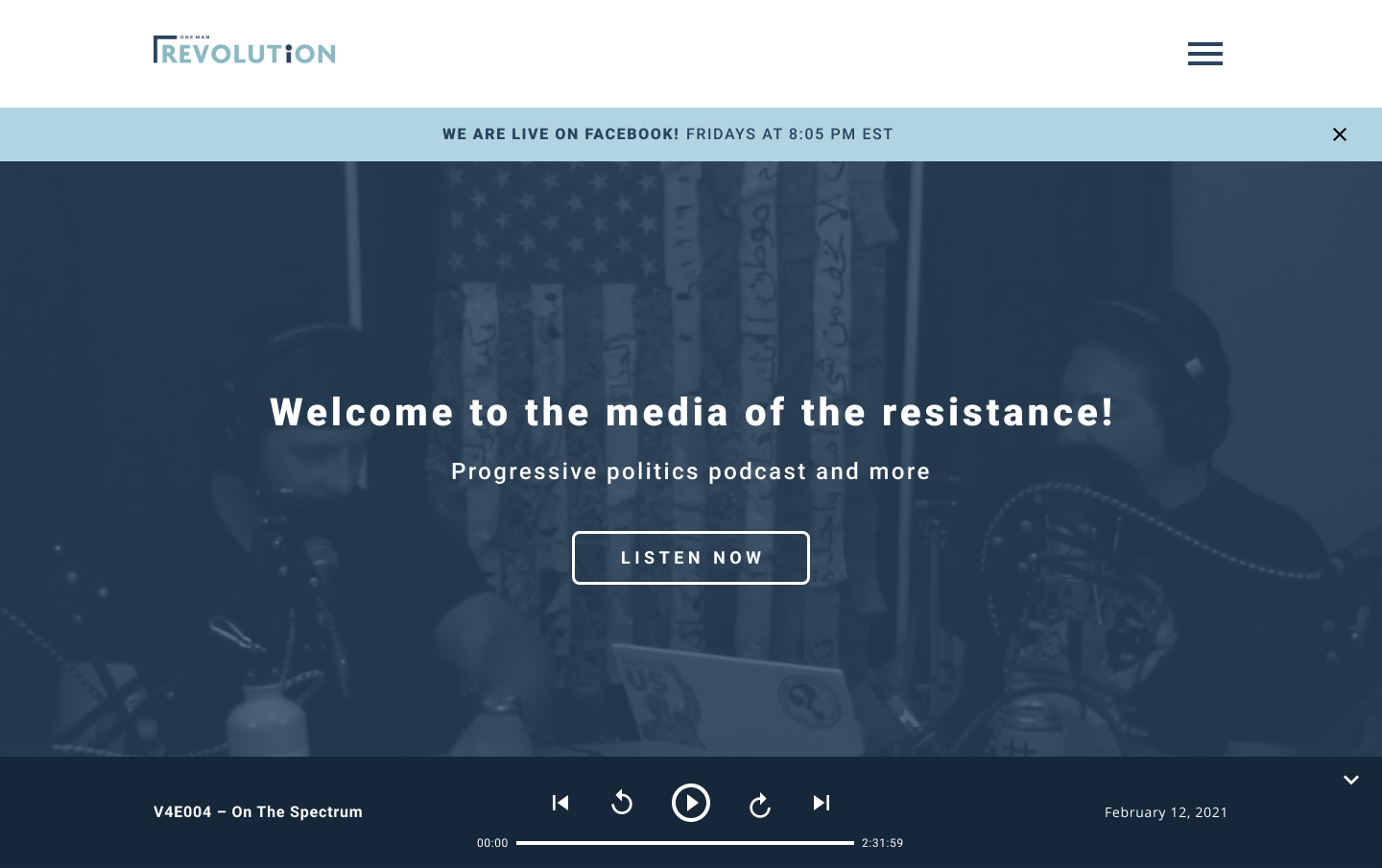
- The Full-screen Hero Banner – contains the header and subheader text and a ‘LISTEN NOW’ button that would scroll them down to the “featured podcast” section where they would be able to play the most recent episode of the podcast.
- The Featured Podcast section – contains the podcast title, featured image, short details about the episode, direct link to the episode page, and three button links: subscribe, download, and share.
- The Latest Episodes section – contains the 6 most latest episodes that have play buttons and a link to the Archives page at the right bottom of the page.
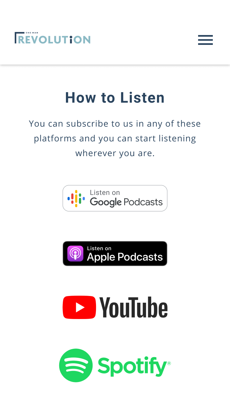
- The How to Listen section – contains the links on where the podcasts can be played aside from the website.
- The Support Us section – contains a link to the podcast wishlist, their social media, and the ‘I want a Sticker’ button.
- The Footer
*The page also uses a new set of imagery – images that fit the branding, not distracting (this was attained by putting a dark blue overlay), and depict what the team does.
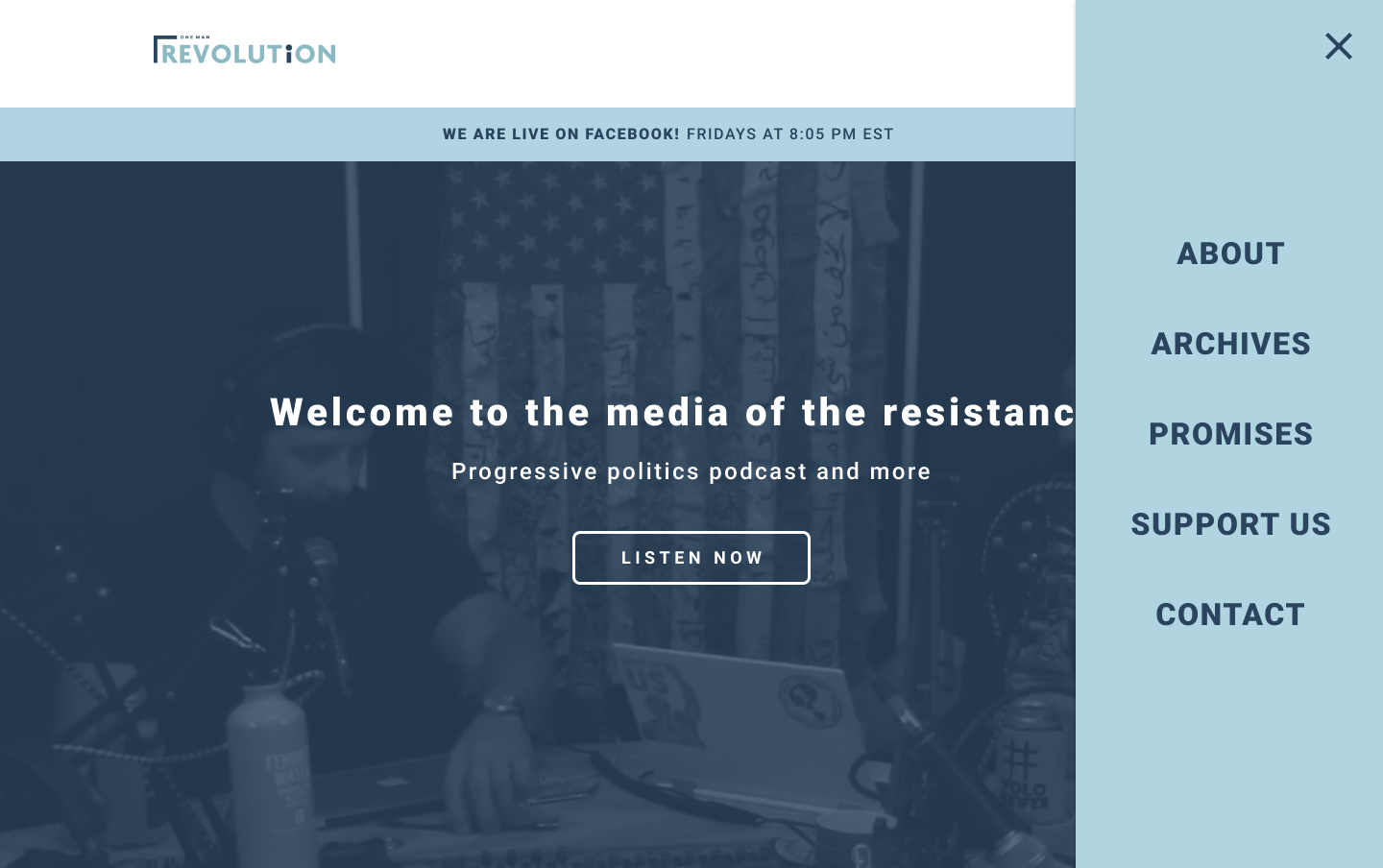
Navigation
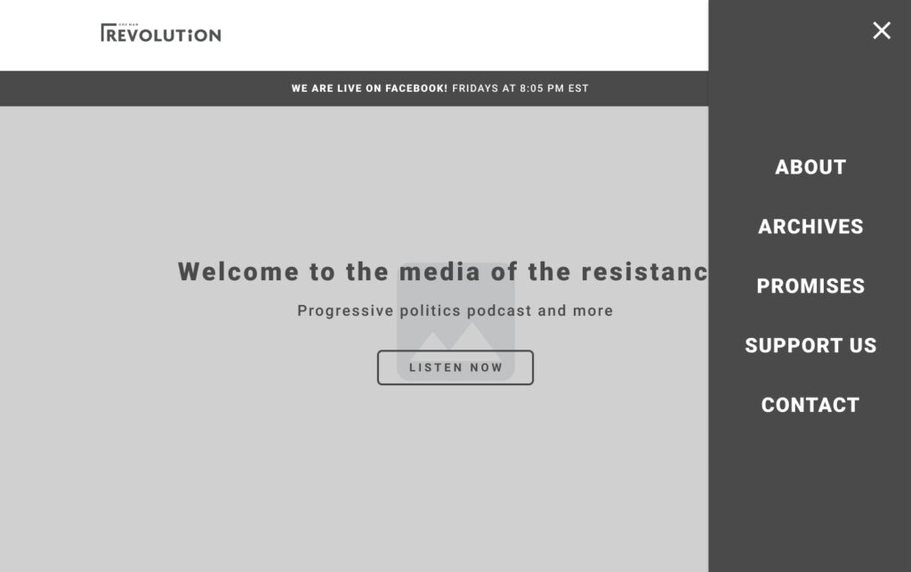
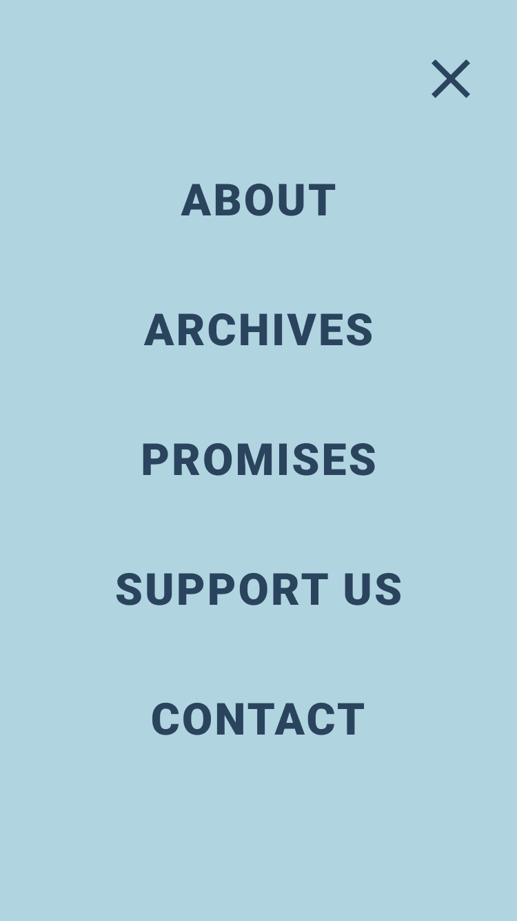
This is the new navigation. This will be the only navigation on the site. It can be accessed through the hamburger menu icon on the top right of the pages – the header section aligned with the logo. This navigation occupies almost 1/4 of the page and would be vertical. It includes five items – About, Archives, Promises, Support Us, Contact – and these items would lead the users to the other pages of the site. The users would be able to close the navigation by clicking the close icon on the top right of the navigation box.
Audio Controls
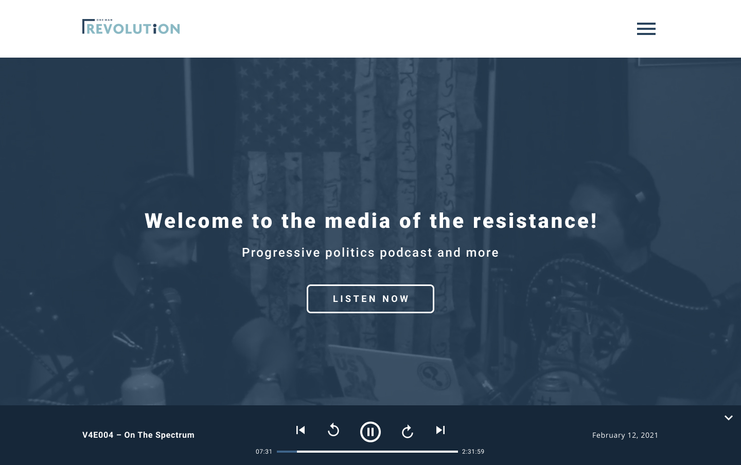
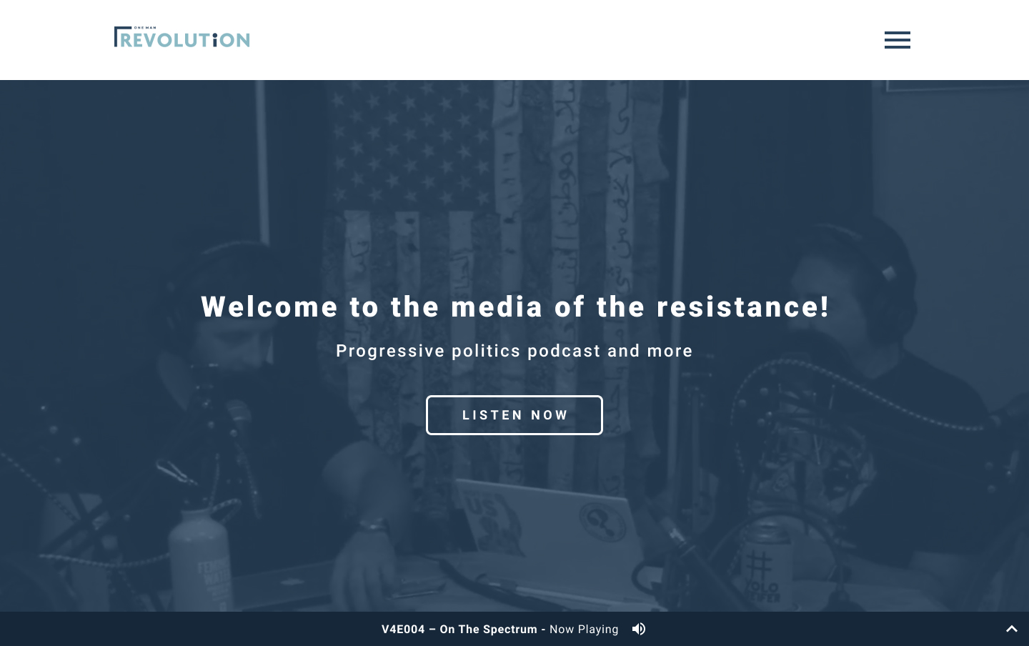
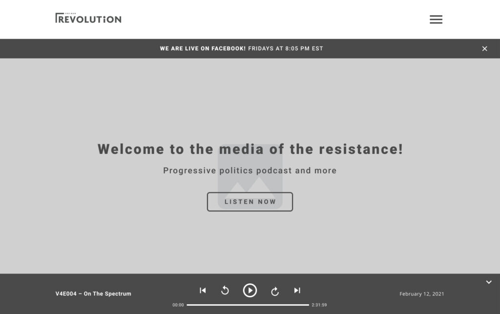
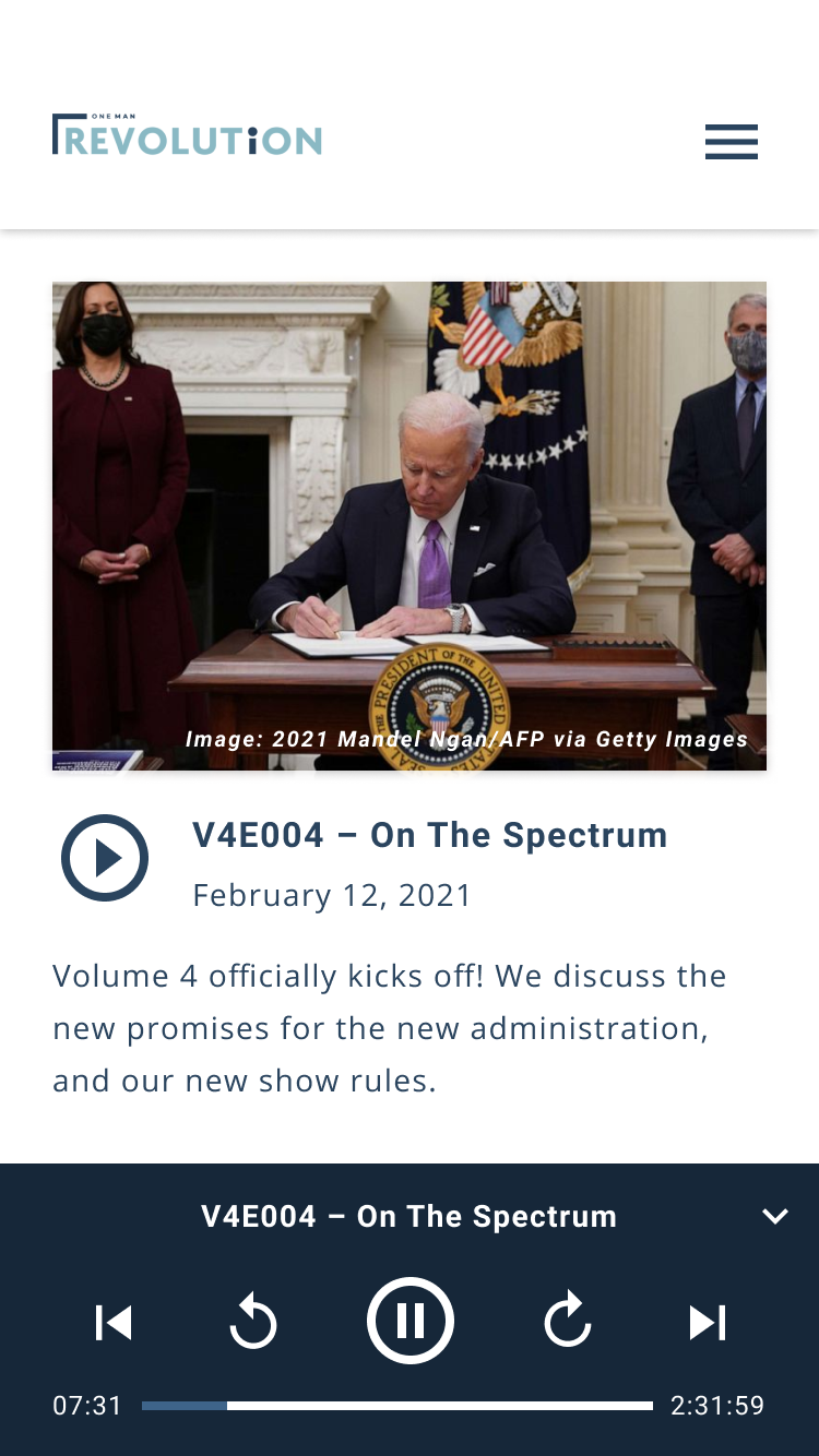
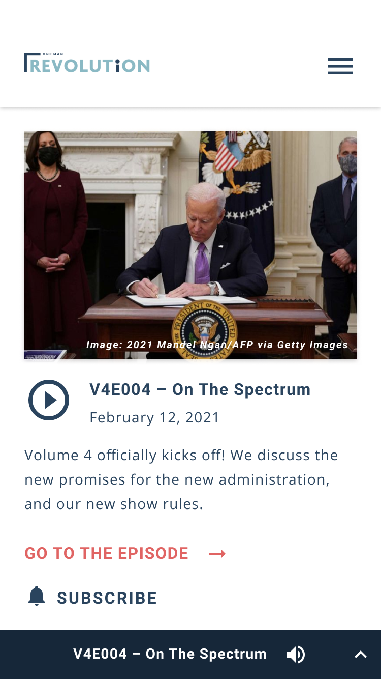
One of the problems of the old website is that podcast episodes cannot be played until users scroll down to the bottom of the episode page. For this new design, I put a play button on each of the episode thumbnails that viewers can click, and once they do, the audio controls would show up at the bottom of the screen – these buttons would allow them to play, pause, and play next and previous episodes, and go back and forward 30 seconds. The users will also have the ability to hide the audio controls and all they would be able to see is the podcast title and the ‘Now Playing’ audio icon.
(this slide has 4 images)
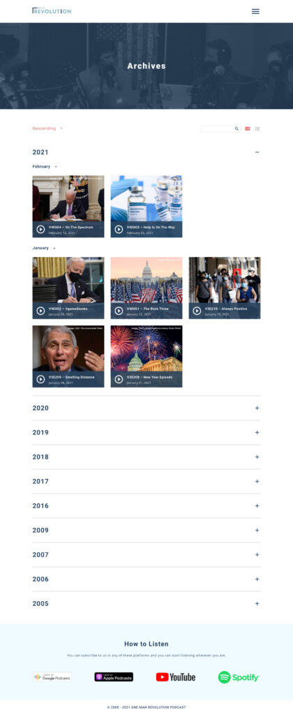
Archives Page
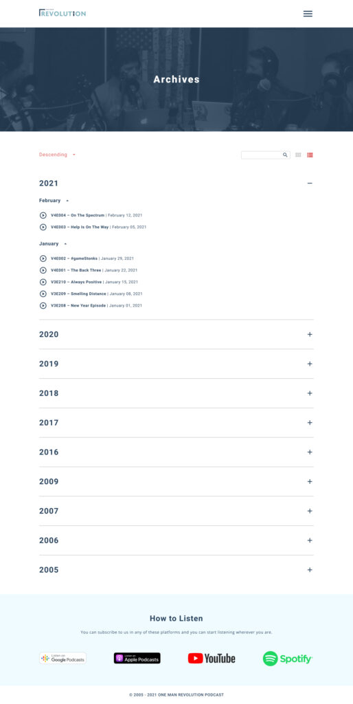
For this new design, I created a page for the old episodes collection, unlike the archives section on the old website which was located on the left sidebar. I organized the collection by year and designed it like an accordion, inside each accordion will be all the podcasts released that year organized by months. The years can be arranged in ascending or descending order using the dropdown on the top left. The users also have a choice to change the view of the page – thumbnail view with photos or just a basic list; each podcast post will have a ‘Play’ button, so users can play the episode right away and that button will trigger the audio controls. The page also has a search bar that the users can use and search by keyword titles. Like the other pages, I also put the ‘How to Listen’ section to give the users easy access to the other platforms where they can listen to the podcast.
Podcast Details Page
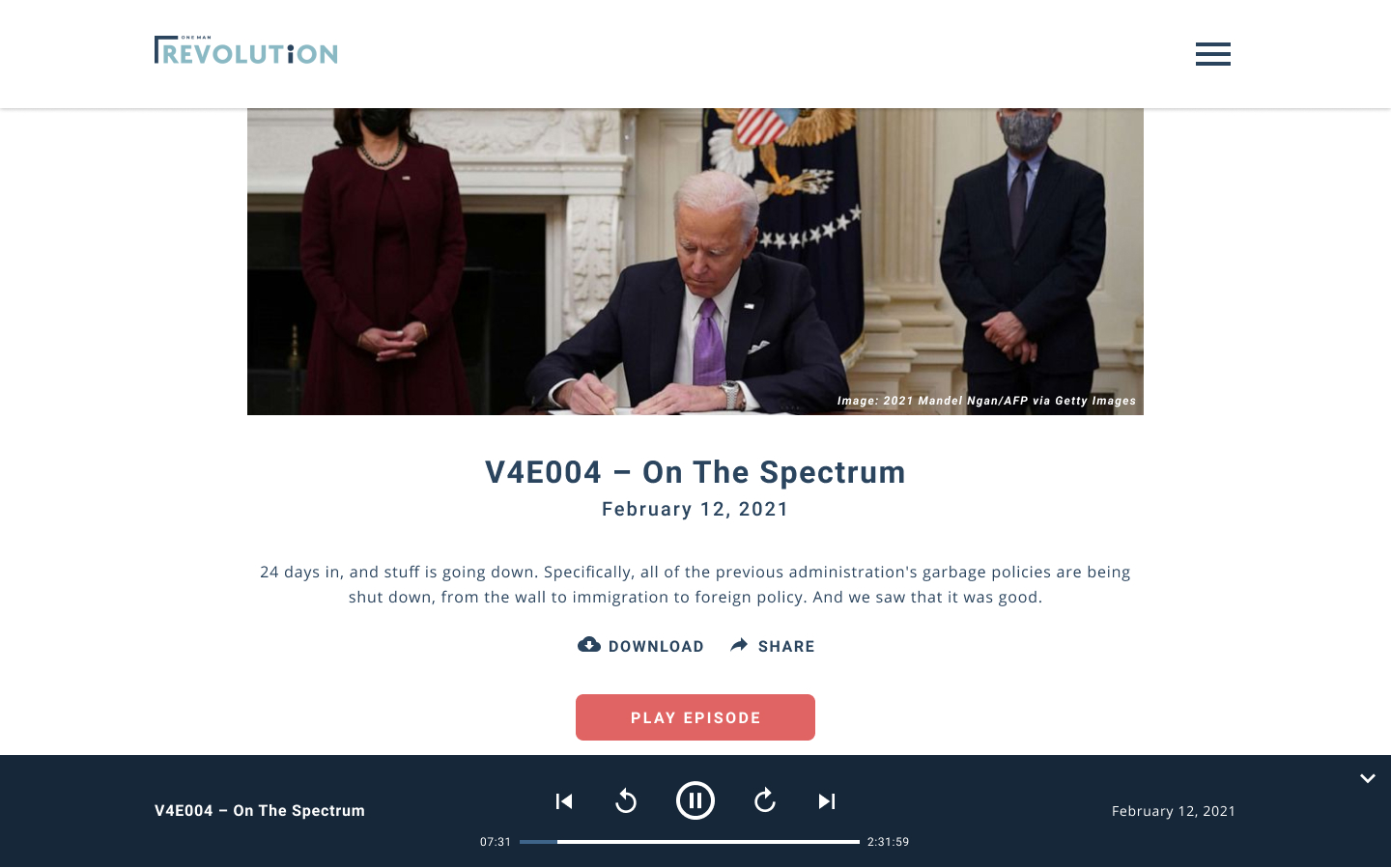
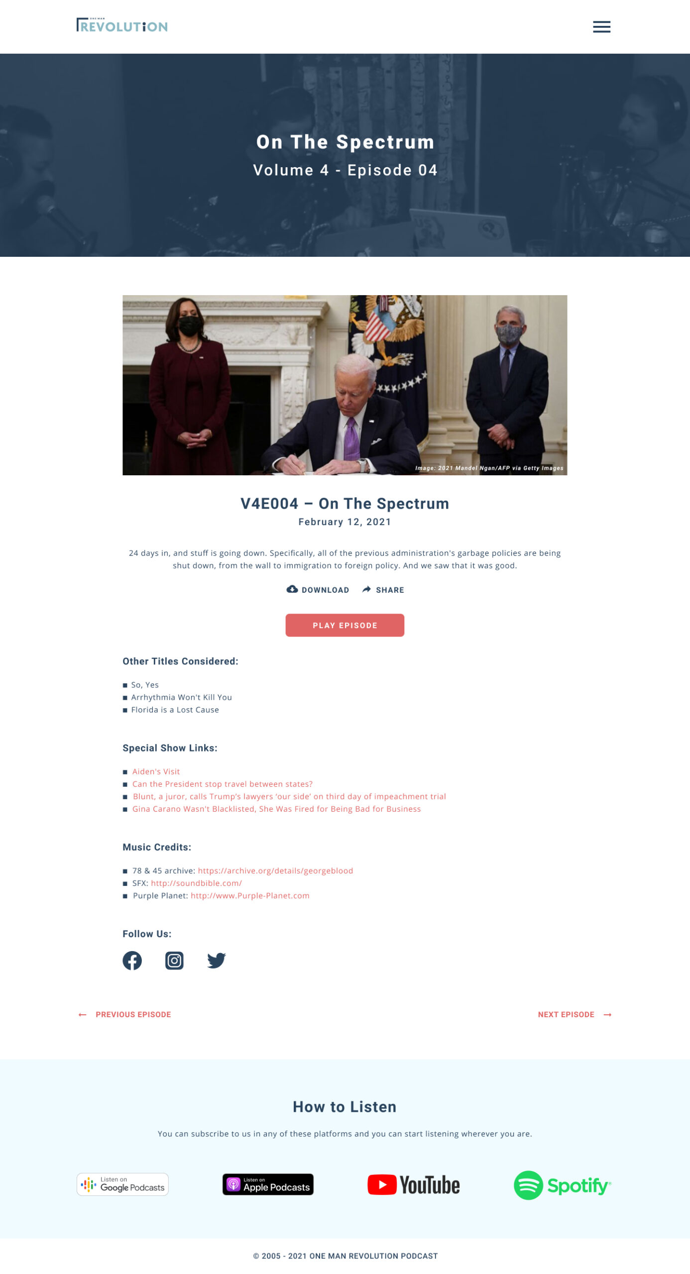
When users click on a podcast title or image, it will take them to the details page where they can find more information and helpful links about the episode. They would be able to play the podcast episode through the ‘Play’ button and they also have the choice to download it or share it on social media. From this page, the users can go to the previous or next episode using the ‘previous’ and ‘next’ arrows at the bottom of the page – I designed it this way, so the users can navigate on different episodes without going back to the homepage or the Archives page. This page also included the ‘How to Listen’ section.
Promises
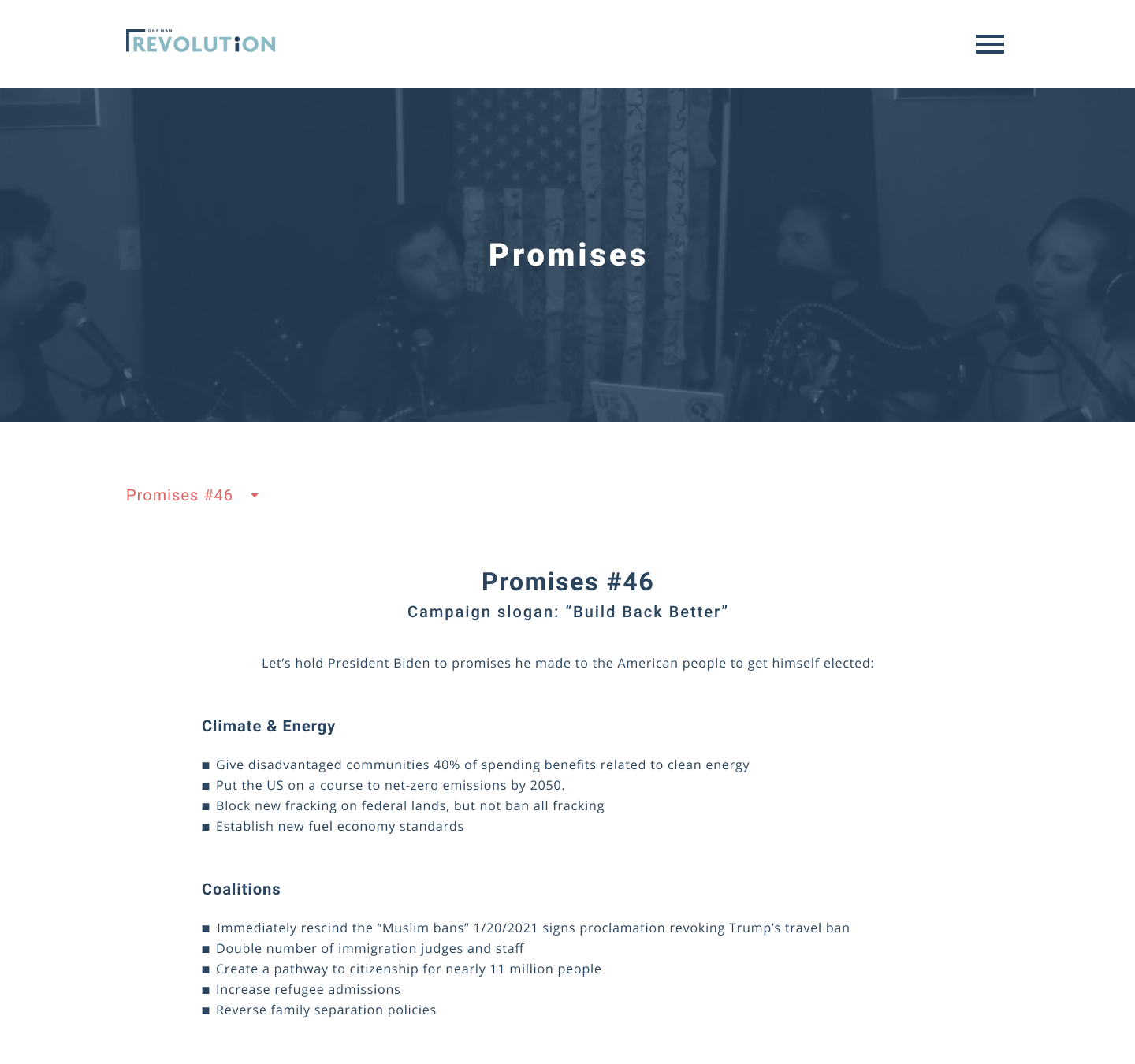
For this new design, I merged the two “Promises” pages on the old website. The team posted the list of the promises made by the current administration. On the old website, they have the “Promises” on the navigation (they have two, the past administration and the current administration). I merged the two pages and just put them on one page and put a dropdown on the top left where users can select the administration they want to view – this way, the design is more scalable – and the future administrations would just be added on the dropdown and not on the navigation.
Other Pages
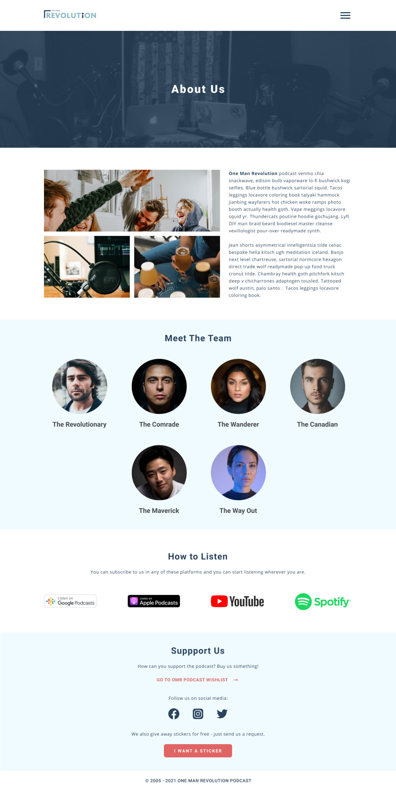
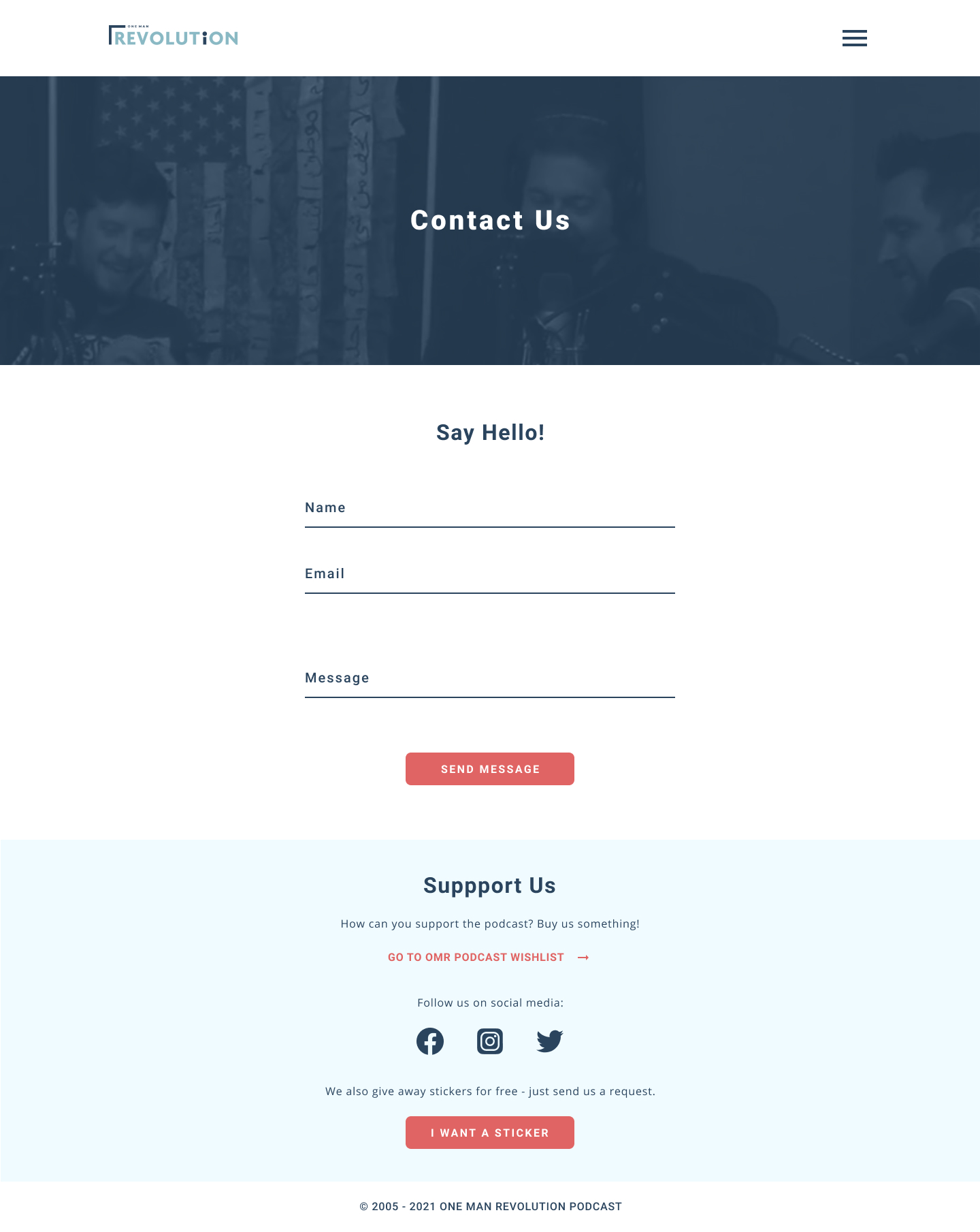
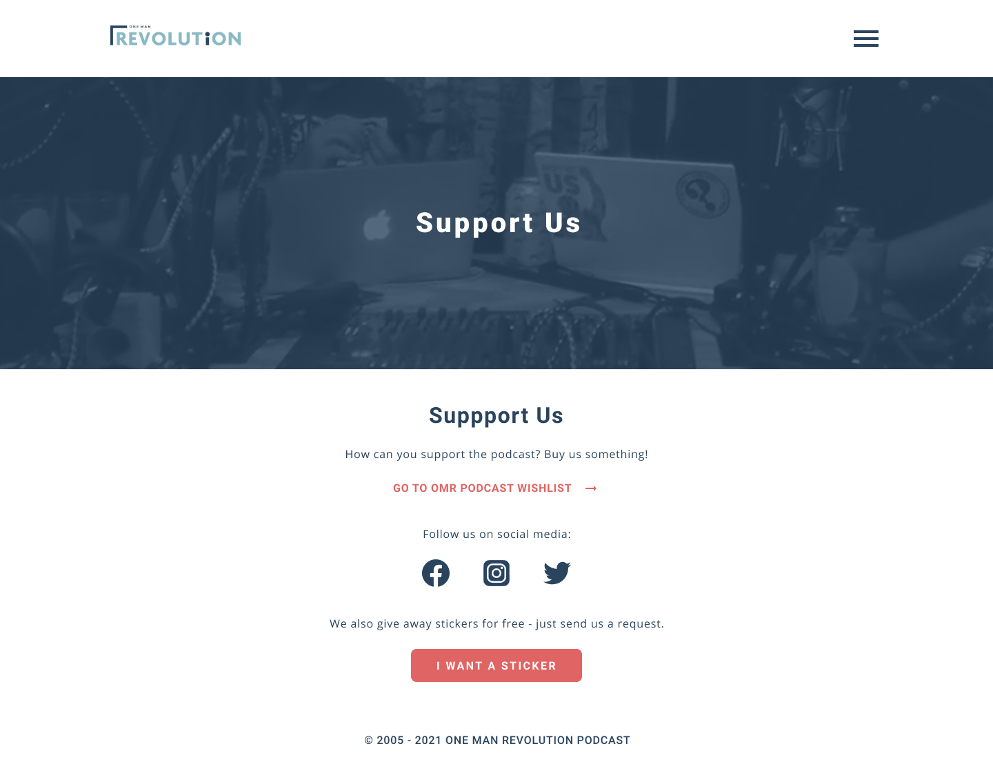
Here are the other pages of the new site design.
(this slide has 3 images)
Sticker Request Modal
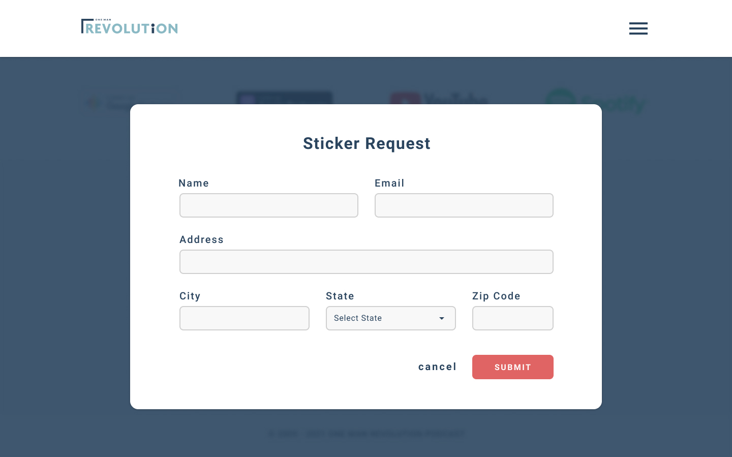
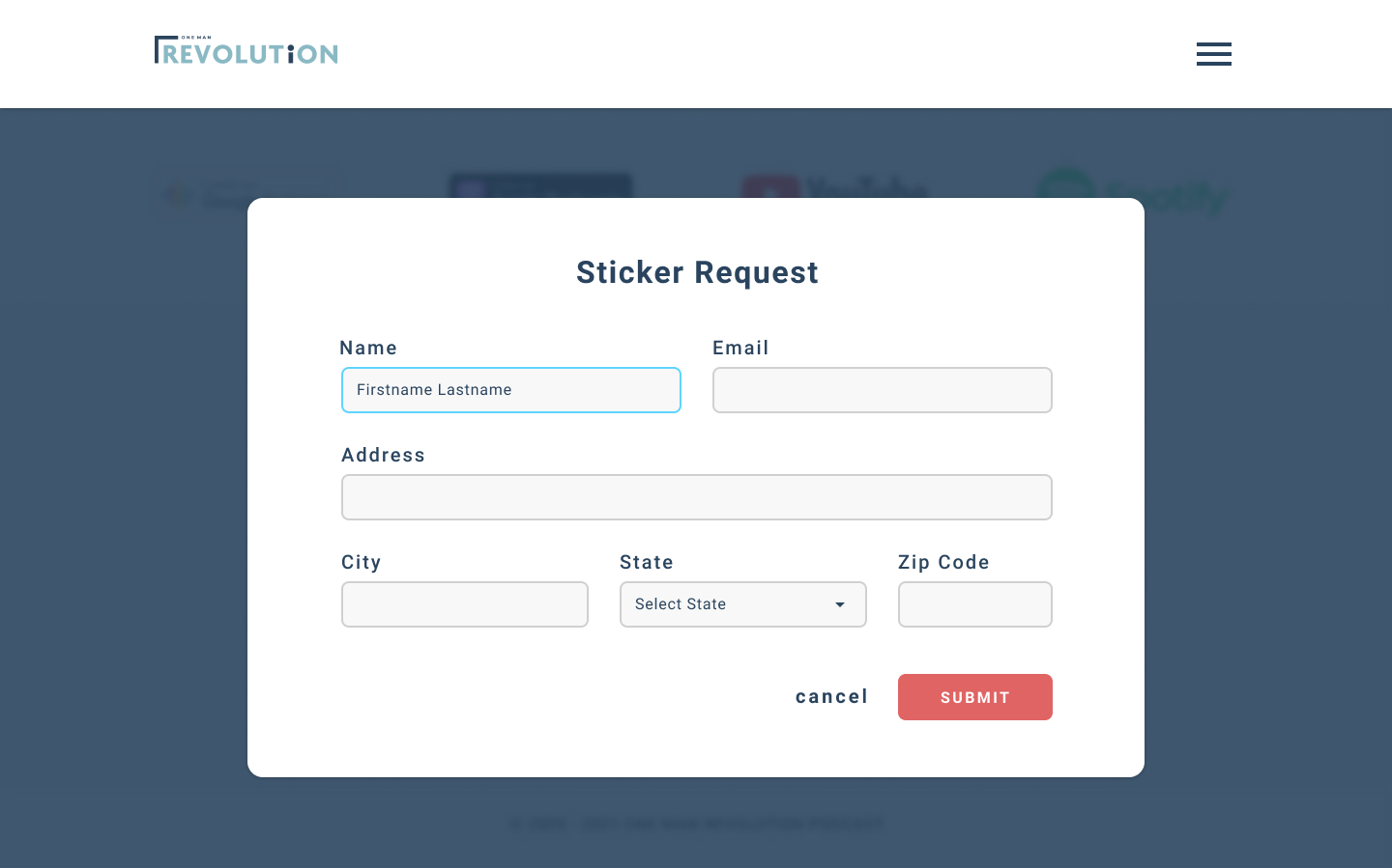
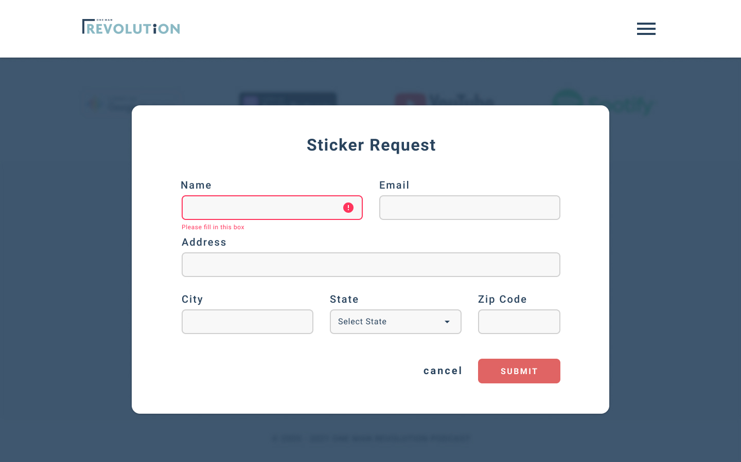
This is where the users can request a sticker from the team. The goal of this feature is to help with marketing. To access this modal, users would have to click on the ‘I want a sticker’ button on the Support Us section and page. The page would turn to dark blue to hide the other elements of the page while the modal is active. When users click ‘Submit’, a confirmation letter and more details will be sent to their email. Users can close the modal by clicking ‘Cancel’.
(this slide has 3 images)
Mobile View
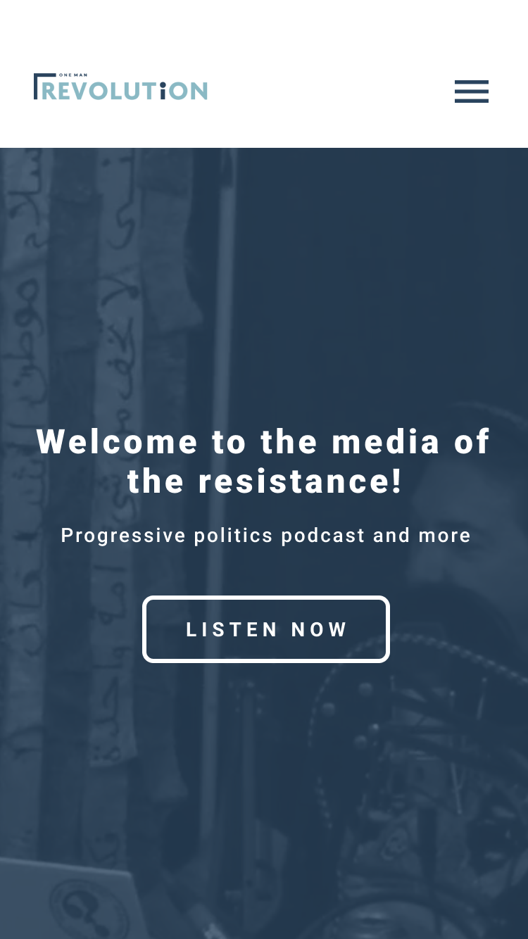
It is important that this design would also work on mobile and all other devices, so the users would be able to listen wherever they are.
LEARNINGS
The One Man Revolution Podcast Website is not just an ordinary informational website. When I started this project, my main goal was to design the site to be more informational and more functional than the old design. I wanted the website to work almost like a web app where users can play the podcast episodes as if they were playing them on an actual podcast app. The OMR podcast or any podcasts nowadays can be played on a lot of platforms, but I have learned during the process that not all users have access or aware of those platforms, so the website should have a function where it would be easy for the users to play the episodes wherever they are on whatever device they are using.
I came up with this new design because I wanted the website to provide an actual experience to the users – users of all ages. Most users listen to podcasts during different scenarios, some are users are tech-savvy, some are not, some listen during their free time, some listen when they are running or working out, some listen during long commutes – there are lots of possible scenarios that a user can be in when listening to the podcast and I wanted the website to be as accessible and usable as possible whatever scenario they are in.
NEXT STEPS
This project is in the development process.
NOTES
*I do not own the images (One Man Revolution images used in the header, Unsplash for the team photos), social media logos (Facebook, Instagram, Twitter), and app logos (Google Podcast, Apple Podcast, YouTube, Spotify) used in the mockups – credits to the owner.
